Client
Vero Insurance
Project
UI in Sketch
Completed
2018
Overview
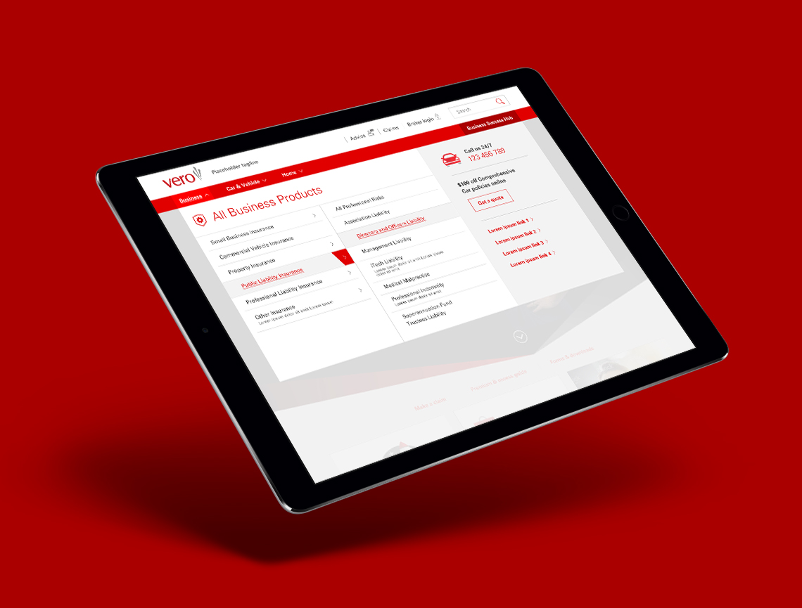
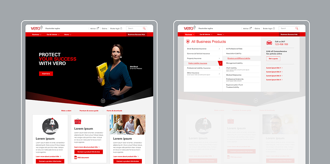
Vero Insurance is an Australian insurance company. Founded in 2003, it is one of the largest insurance companies in Australia. Vero provides market leading insurance products and solutions to businesses of all sizes.
Challenge
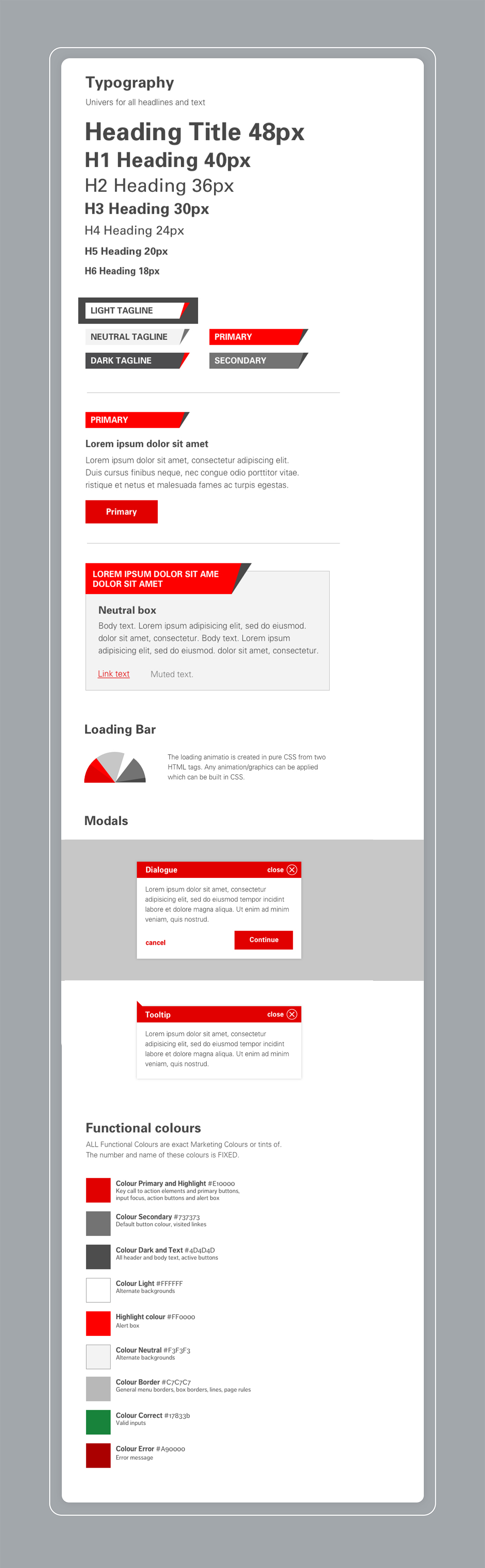
The challenge was to create a UI kit for a corporate brand that has a pre-established strict guidelines. The Vero brand also has a very limited colour palette – red. And... grey, five shades of grey.
Challenge
The challenge was to create a UI kit for a corporate brand that has a pre-established strict guidelines. The Vero brand also has a very limited colour palette – red. And... grey, five shades of grey.
Working alongside a big team of in-house developers to find a happy middle ground between expressing the brand and creating a functional UI kit that will work within an existing website template.
Working alongside a big team of in-house developers to find a happy middle ground between expressing the brand and a creating a functional UI kit that will work within an existing website template.
Working alongside a big team of in-house developers to find a happy middle ground between expressing the brand and a creating a functional UI kit that will work within an existing website template.
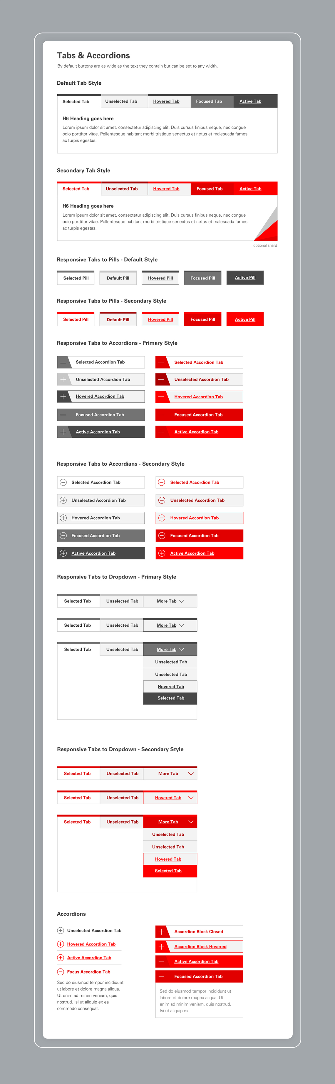
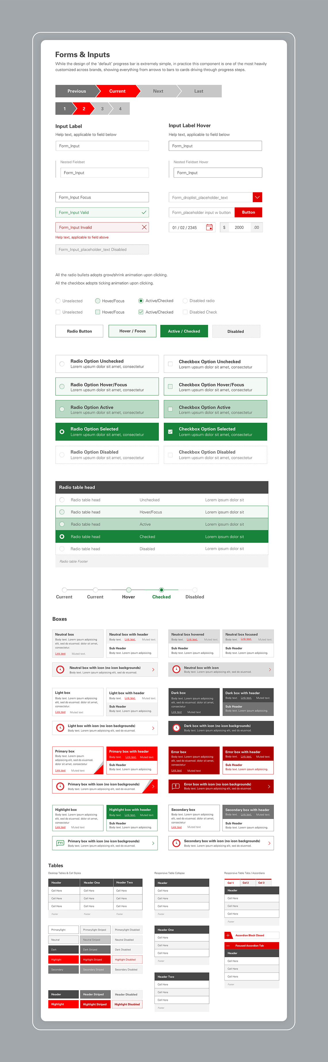
Execution
At the completion of the project, there were 7 in-house developers and producers that reviewed and approved the UI kit.
It was a valuable experience as I learnt from various perspectives how something as seemingly simple as a button, or the colour red can make or break the UI system.
Execution
At the completion of the project, there were 7 in-house developers and producers that reviewed and approveed the UI kit.
It was a valuable experience as I learnt from various perspectives how something as seemingly simple as a button, or the colour red can make or break the UI system.
I feel that a more agile approach should have been taken where the designer, would be able to review and finesse the finished product to make sure that the bits and pieces work together well and look seamless.
Something quite esoteric as design needs fine tuning, eye-balling and readjusting even for a digital execution such as website. It needs to be tested and constantly improved.
Selected Works
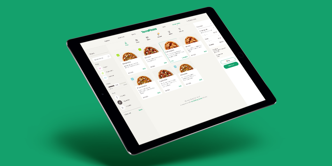
TerraPizzasTake Home Test, Ecommerce, UX & UI
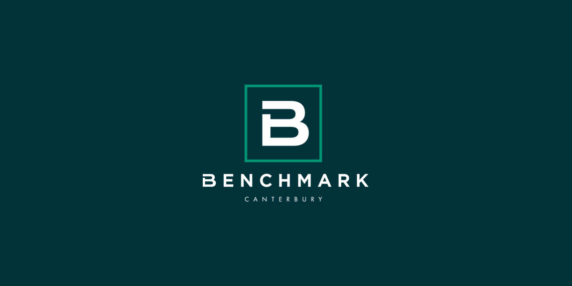
Benchmark GymUX Research + Usability Testing + Prototype
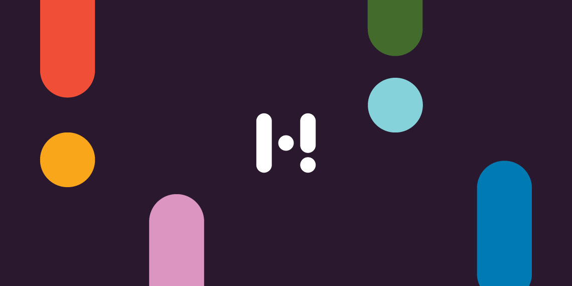
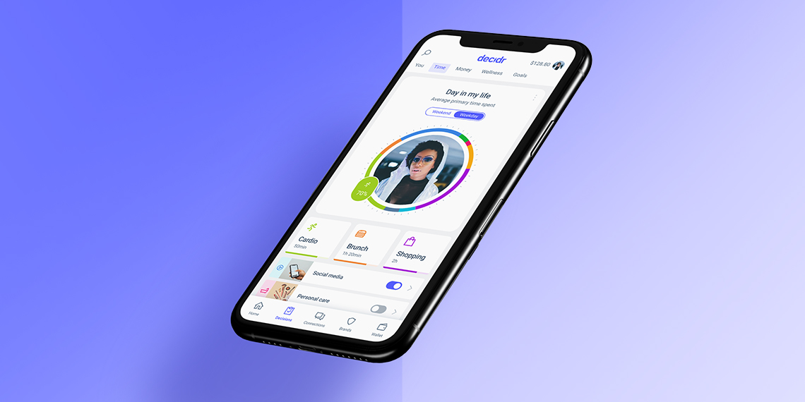
Hay (aspiring neobank) - work in progressMobile App, Product Design, UI & UX
Responsive Saas platform – light & dark Theme – work in progressDesign System, Dark & Light Mode, Logo
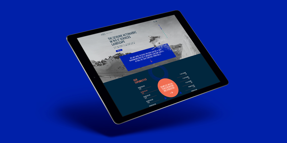
ASGLogo + Website
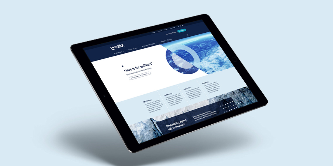
CalixLogo + Visual Identity + Website
PayrightLogo + Visual Identity + Campaign
HakoahVisual Identity

DeputyVisual Identity + Illustration
ImaginenationVisual Identity + Website
LogosLogotype & Logomark
EquifaxWebsite, eDM, Visual Identity, Print

Vero – Qantas Business RewardsMini campaign
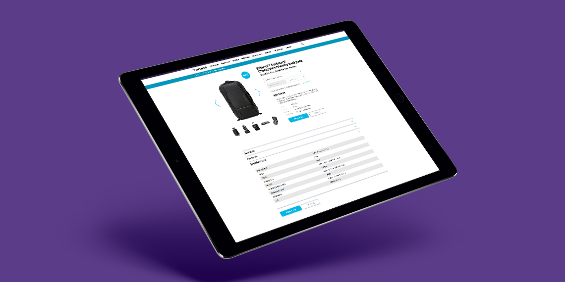
TargusWebsite improvement
CatholicCare WollongongVisual Identity

Vero – Risk Profiler ToolIconography, Digital Online Tool
All content © of the design agency and respective brands 2017-2020.