I am currently working at Hay as a UX + UI designer
• Competitive intelligence research of the neo-bank landscape to inform feature developments
• Planning of phases, wireframing and conducting user interviews, surveys and usability testings
• Liaising with the development and operations teams on design and function iterations
• Design user flow, wireframes and user interface for the upcoming Savings Pots and Cashback Rewards features on Hay fintech app
• UX & UI audit of the Hay banking app to address KPIs and for continuous improvement
• Clickable highh-fidelity prototype
Watch this space!
Saving pots feature - HayStacks
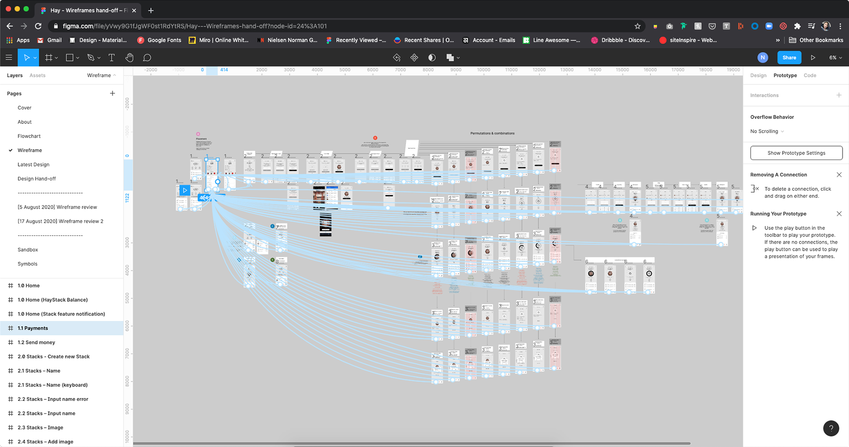
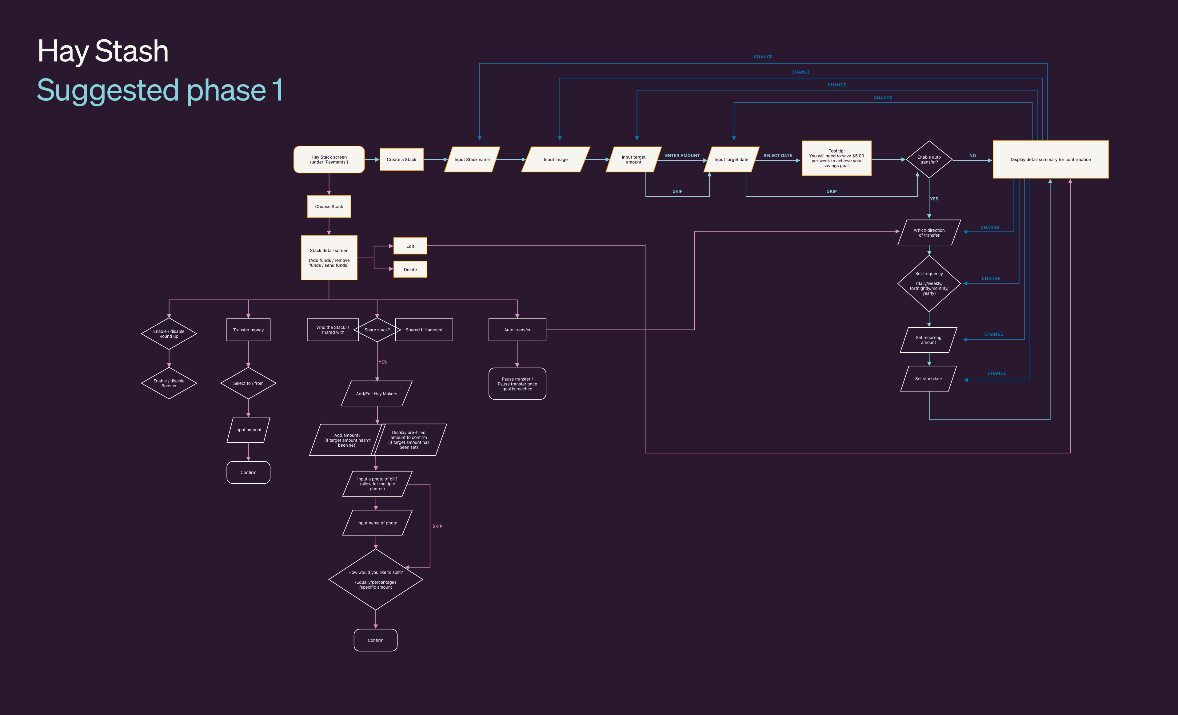
Below is the high-fidelity wireframe and prototype for phase 1 of Saving Pot feature. I started the project by conducting a general survey of what our users would like to see in the Hay app. Then researching on the offerings of competitor apps and presenting that to the company. Which informs the discussion for what is best for Hay with the relevant departments. After breaking up the features into different phases, I started on the user flow and wireframes below.
Using Figma prototyping tool and Zoom, I conducted a few rounds of qualitative facilitated remote user testing, with the internal staff at first and then with Hay Founders (early adopters of Hay). I love seeing a pattern emerge and being able to rapidly improve on the prototype as I go. I also enjoy learning about the many different ways users do to save up for something. Listening to their concerns from their point of view really widens my understanding of how the Hay app can help to enhance their saving habits and in turn drive the Hay KPI. The next stage is a quantitative clickable prototype test using Maze to further validate the user experience.
Cashback referral rewards
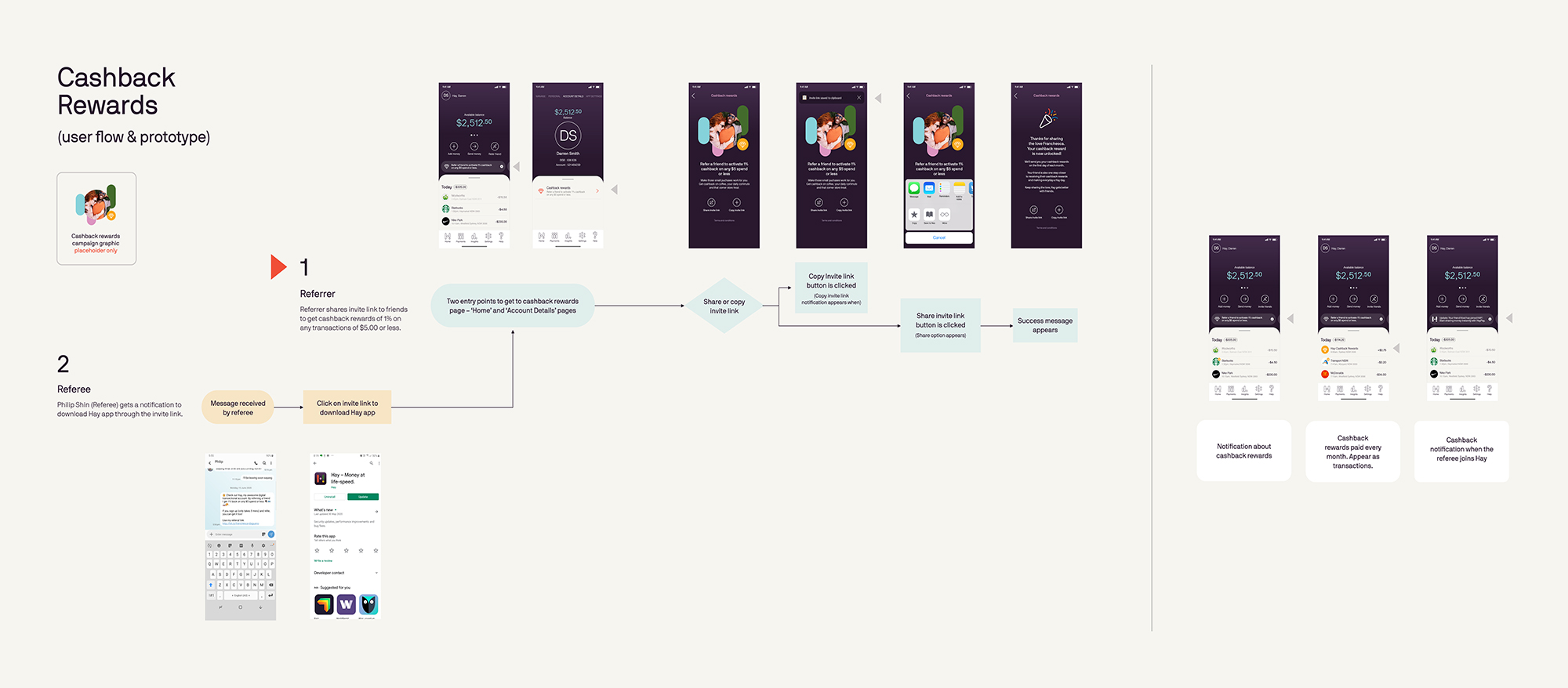
Below is an handover document for a smaller feature – Cashback Rewards. As it is quite a simple addition to the current app, I decided to go straight into using the existing GUI. Apart from adopting the existing UI, I also created the campaign graphic for Referral Rewards to take the opportunity of the screen as a prime real estate to promote the new feature.
To help the developer and project manager who are located in UK and Ireland, I've merged the Flowchart to the revelant screens together and annotate accordingly for a clearer handover.
To help the developer and project manager who are located in UK and Ireland, I've merged the Flowchart to the revelant screens together and annotate accordingly for a clearer handover.
Domestic Travel Feature
Developer and operations walkthrough
Part 1 & 2
Domestic Travel Feature
Developer and operations walkthrough
Part 1 & 2
To align the developers and project managers who are located in UK and Ireland understand the context of what it is we are solving, I've put together a short a sweet video.
Selected Works
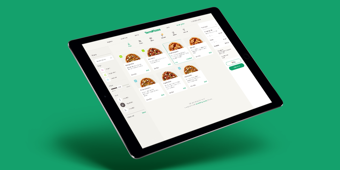
TerraPizzasTake Home Test, Ecommerce, UX & UI
Benchmark GymUX Research + Usability Testing + Prototype
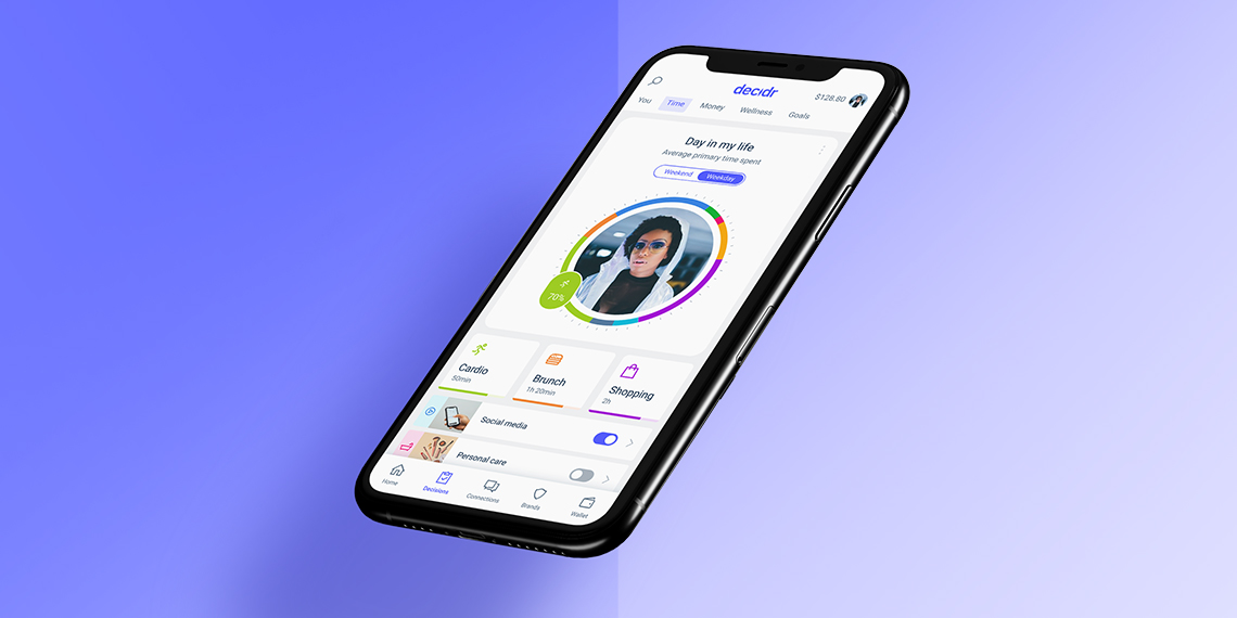
Responsive Saas platform – light & dark Theme – work in progressDesign System, Dark & Light Mode, Logo
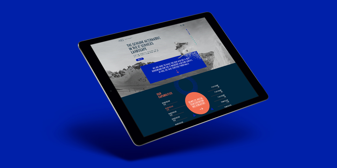
ASGLogo + Website
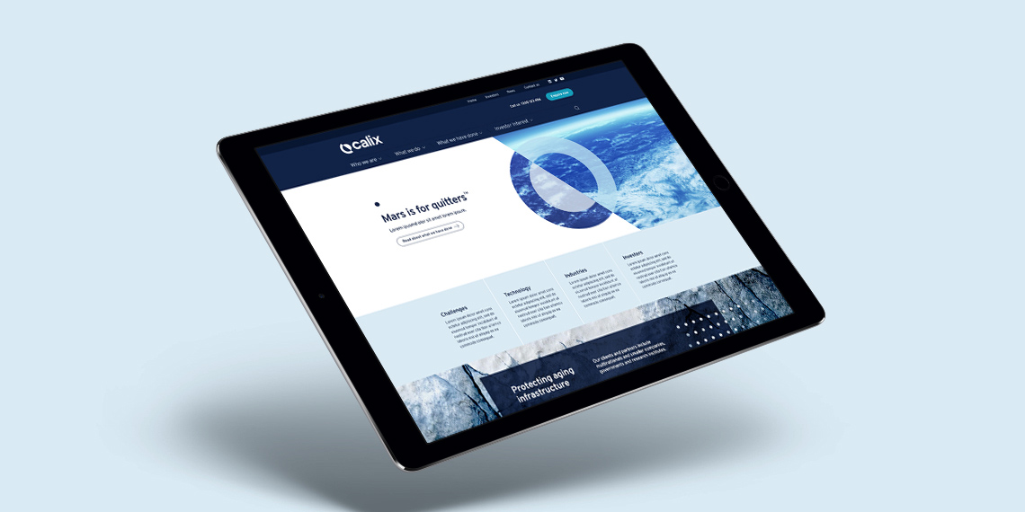
CalixLogo + Visual Identity + Website

PayrightLogo + Visual Identity + Campaign
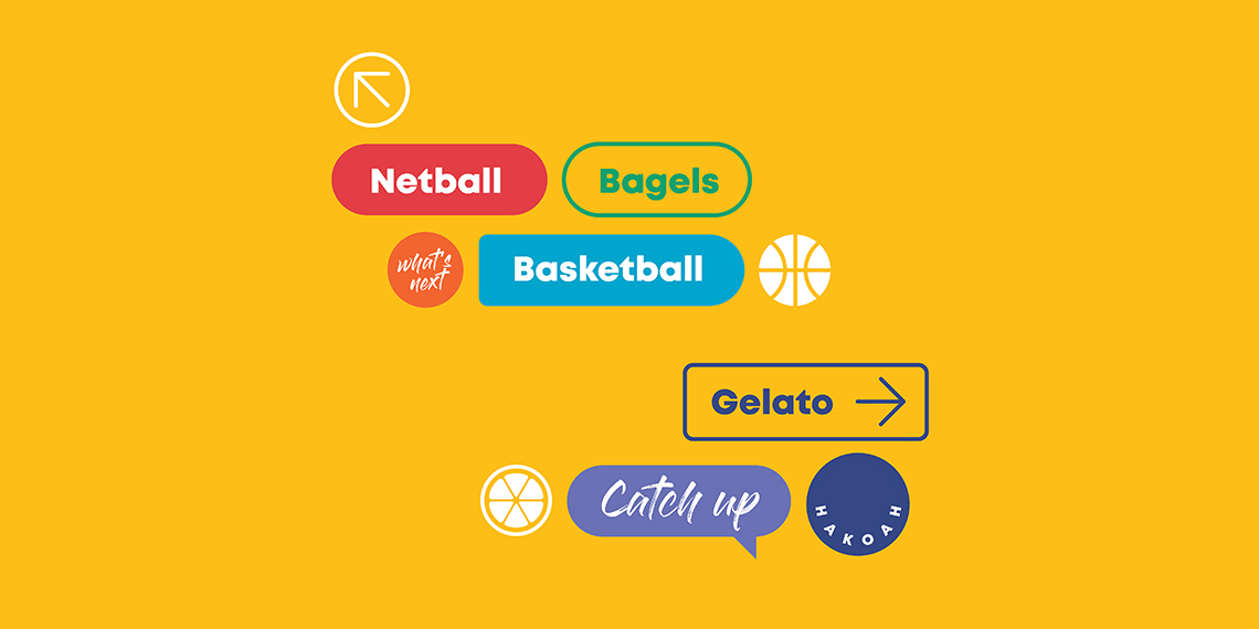
HakoahVisual Identity

DeputyVisual Identity + Illustration
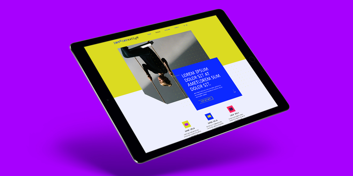
ImaginenationVisual Identity + Website

LogosLogotype & Logomark
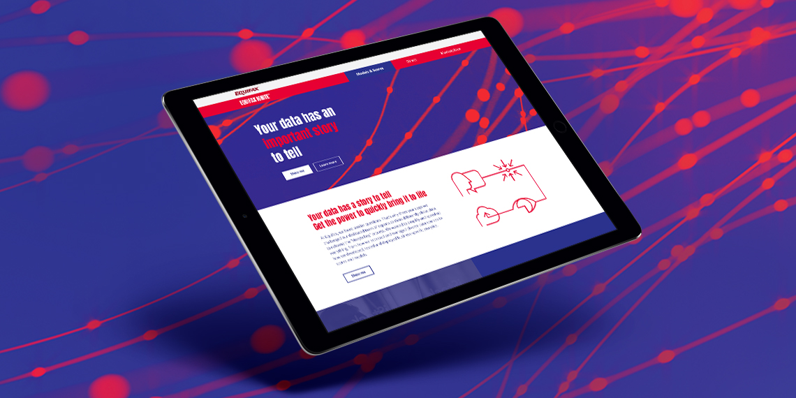
EquifaxWebsite, eDM, Visual Identity, Print

Vero – Qantas Business RewardsMini campaign

Vero - UI KitUI Kit
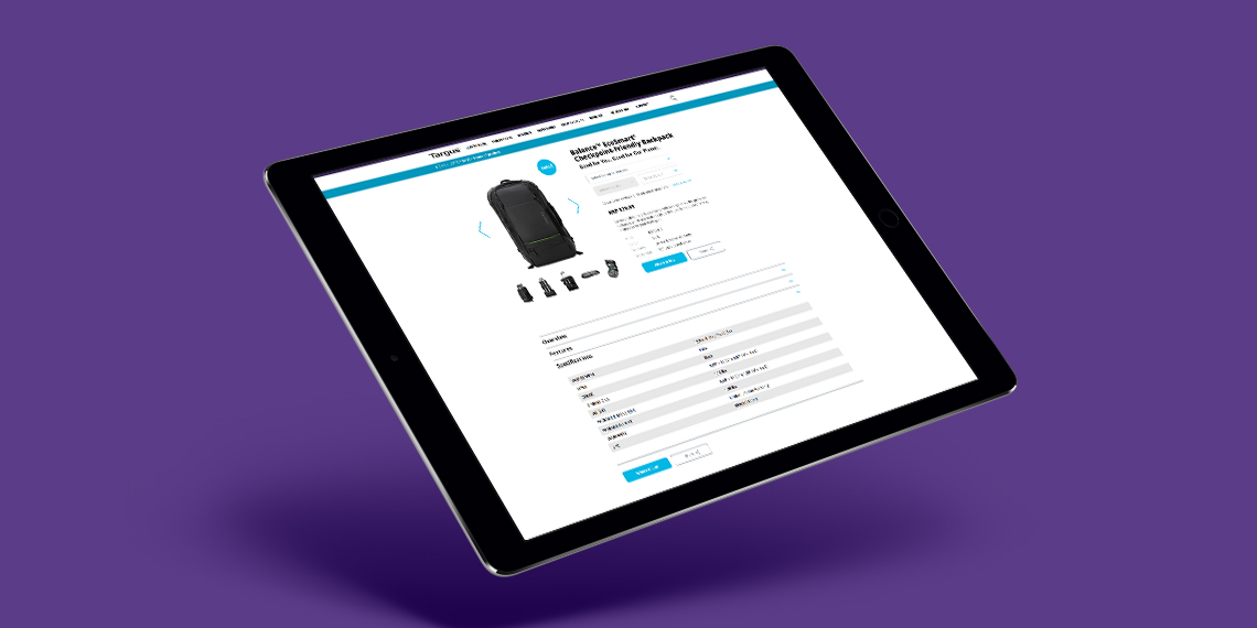
TargusWebsite improvement

CatholicCare WollongongVisual Identity

Vero – Risk Profiler ToolIconography, Digital Online Tool
