Product / Visual Designer Position – Take Home Test
This task was given to me in an interview process, to create an online pizza shopping experience
that includes Homepage and Pricing page for both mobile and desktop view.
Contents
The Brief
Task Breakdown
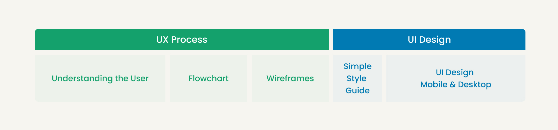
UX Process:
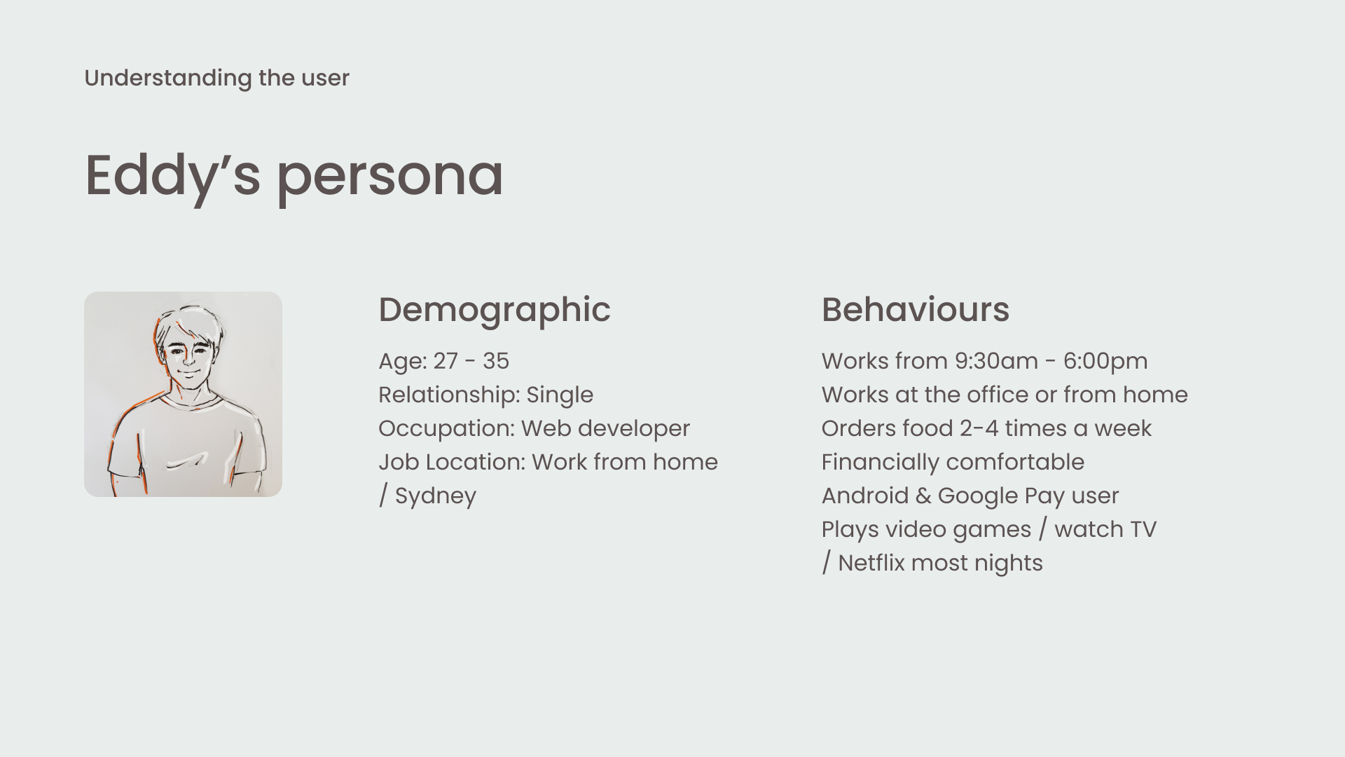
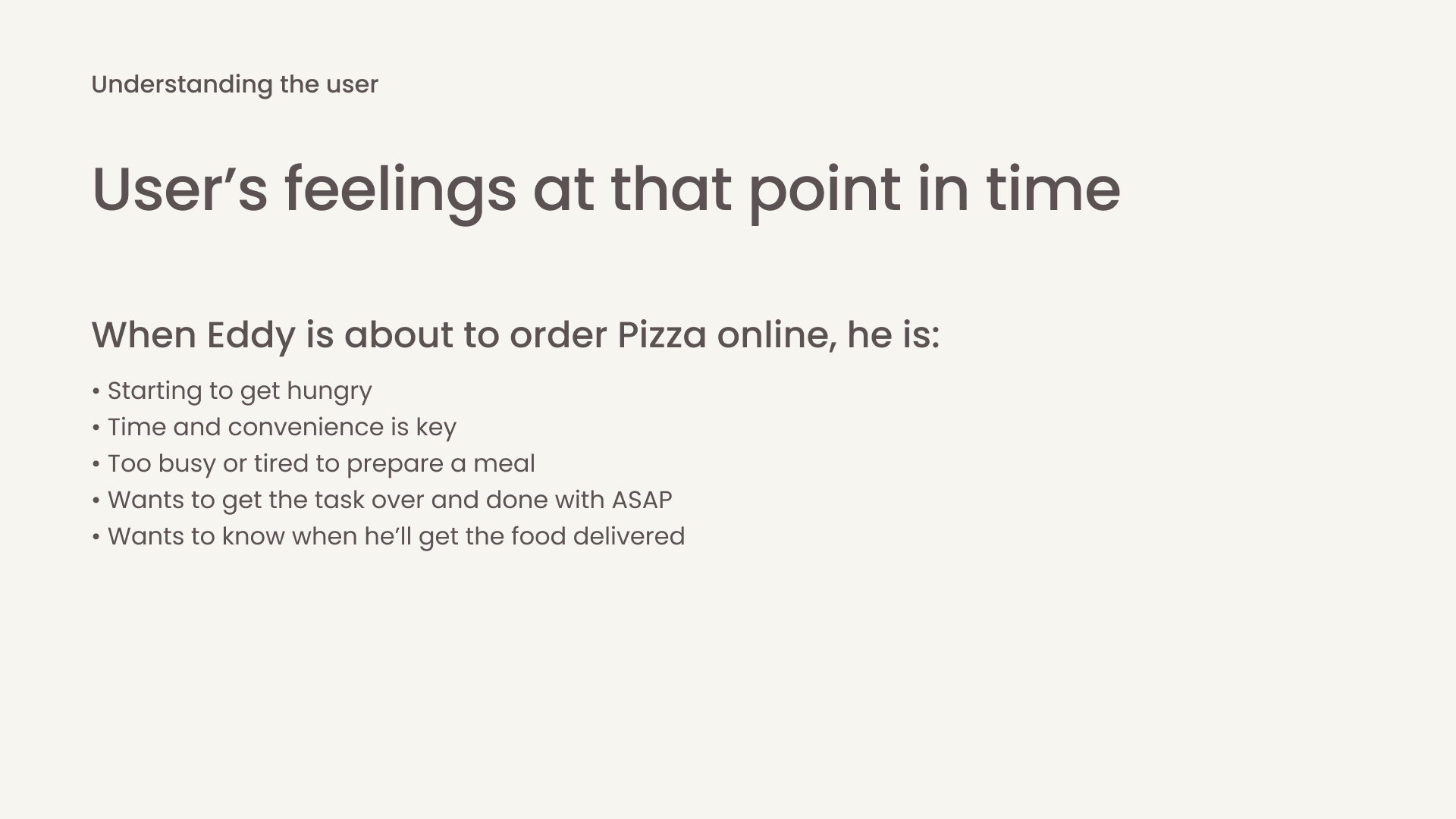
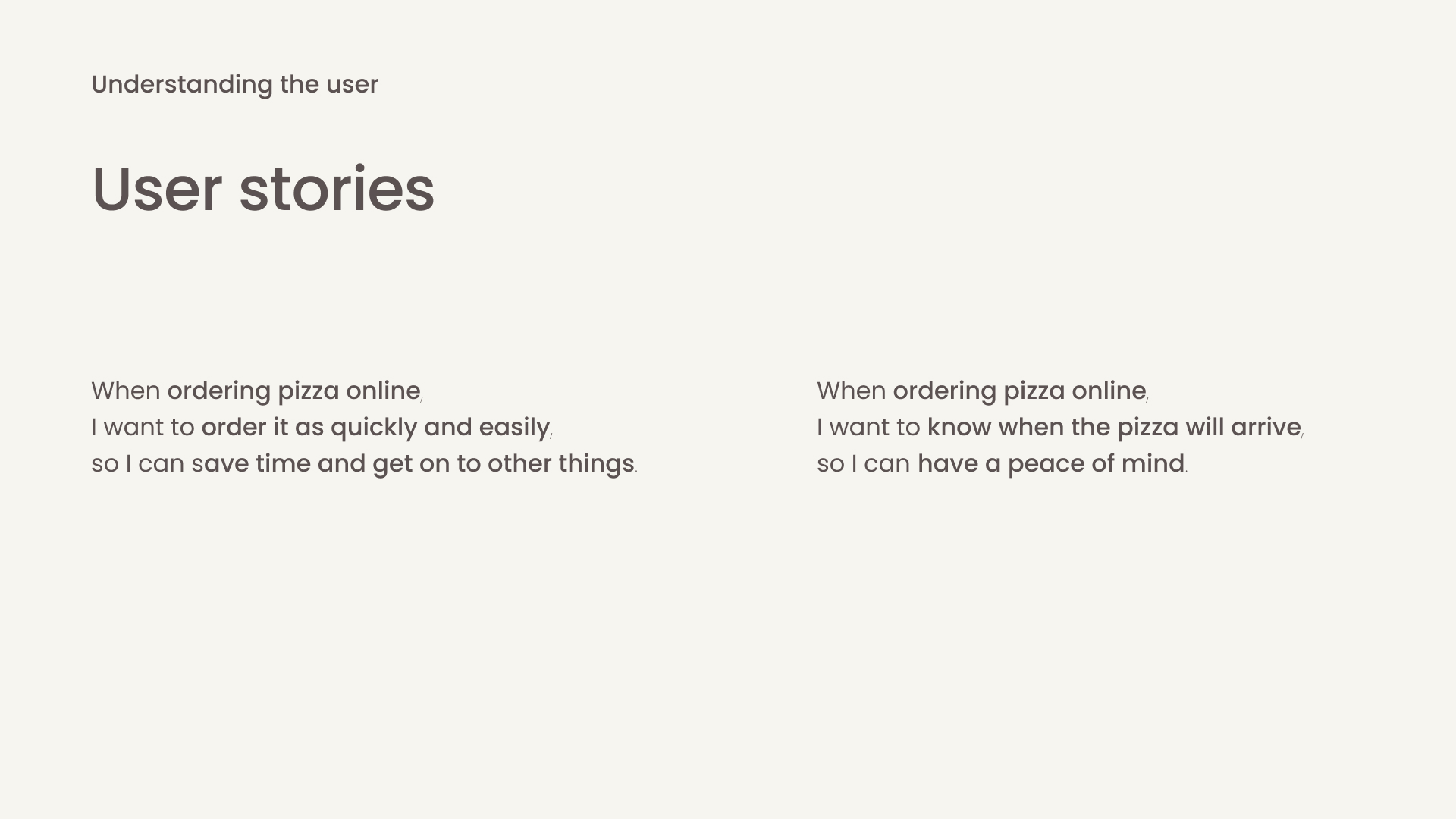
Understanding The User
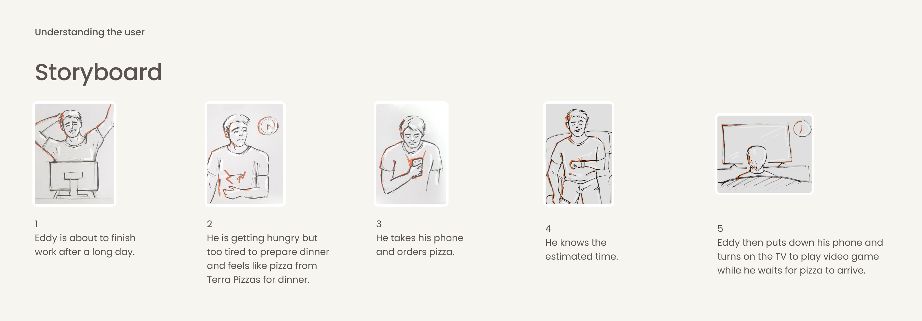
User Stories & Storyboard
Tradeoffs & Assumptions
Flowchart
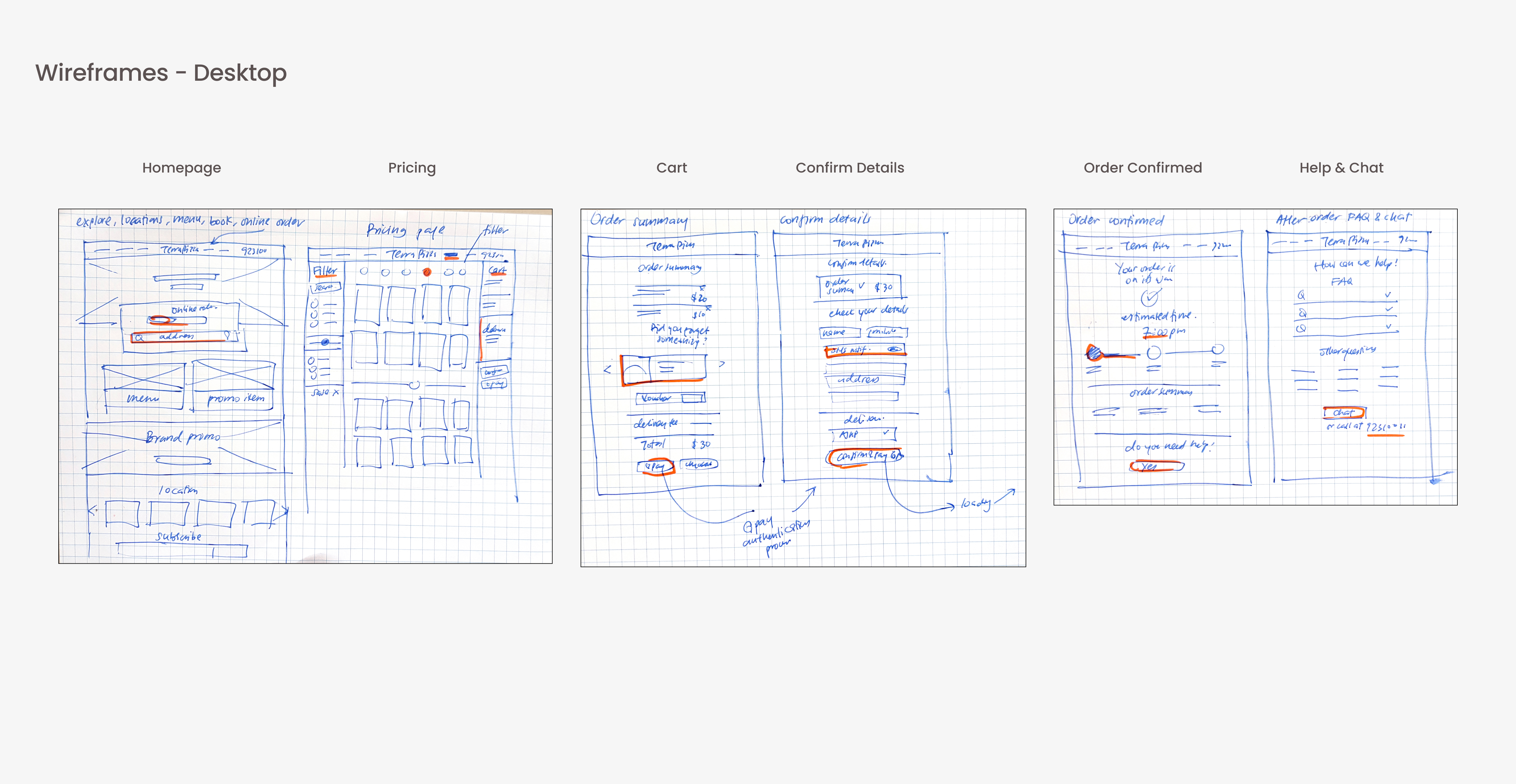
Wireframes
UI Process:
Logo
Style Cheat Sheet
Mobile & Desktop Designs
Next Steps
The task was to create an online pizza shopping experience that includes Homepage and Pricing page.
The Brief
Time
1 week! (As I was working 5 days a week on 2 jobs, I had the weekend and weekdays after working hours to work on this task.)
Target Customer
John & Jane Terra are small business owners with multiple pizza restaurants across the city.
Goal
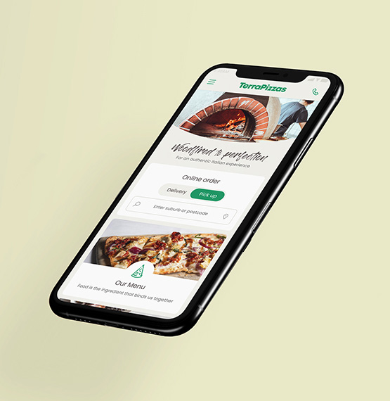
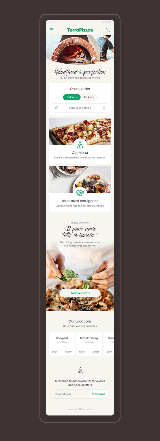
Create an online pizza ordering website for Terra Pizzas, where a customer can order pizza from any of their multiple locations.
Mission
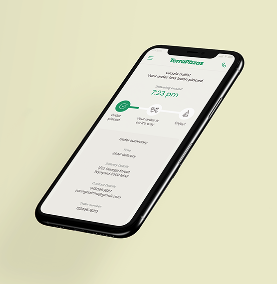
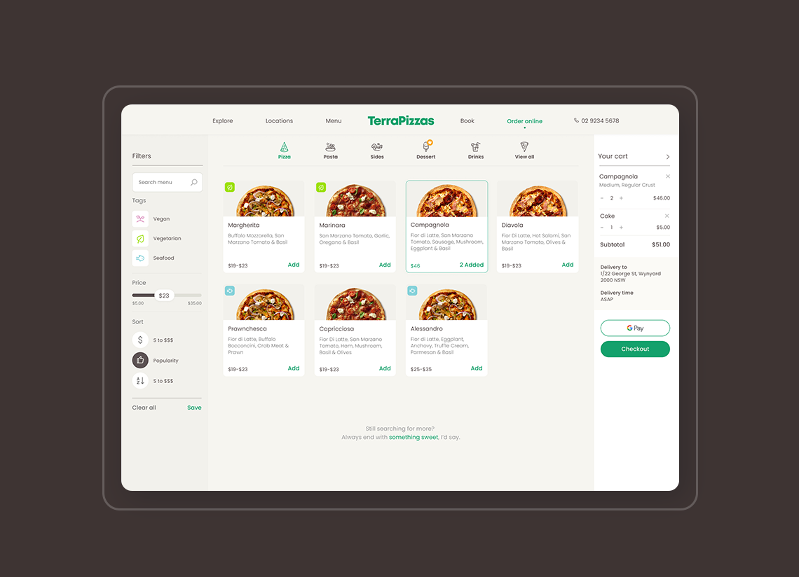
Create a shopping experience that includes a Homepage, and a pricing page for desktop and mobile. It should include the ordering process and upsells (salad, beverage, etc) without sounding salesy.
Deliverables
As you are applying for a Product Visual Designer position you will be primarily evaluated on the visual design skills. We’d like to see minimally, a static, high fidelity visual design execution of Homepage and Pricing page. However, as a product designer, we will also be looking at your problem-solving process and
usability thinking which can be supported with wireframes or sketches of the whole shopping experience.
We would like you to present your process, your final work and answer questions in person. Please be prepared to walk us through your journey and how you made design decisions that lead to the final outcome.
You decide on how much time you want to put into this exercise and we thank you for taking your time.
Task Breakdown
Task Breakdown
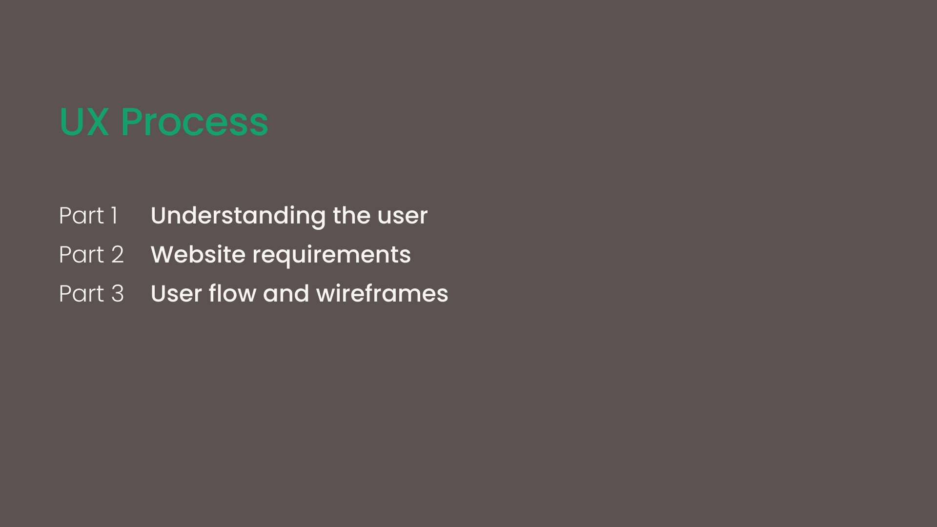
In the interest of time, I went straight into UX process without interviewing the stakeholders. The UX process is divided into three parts; understanding the user, flowchart and wireframes.
In the interest of time, I went straight into UX process without interviewing the stakeholders. The UX process is divided into three parts; understanding the user, flowchart and wireframes.
As logo and visual identity is NOT part of the task, I decided to only allow myself half a day maximum to create a simple style guide.
UX Process
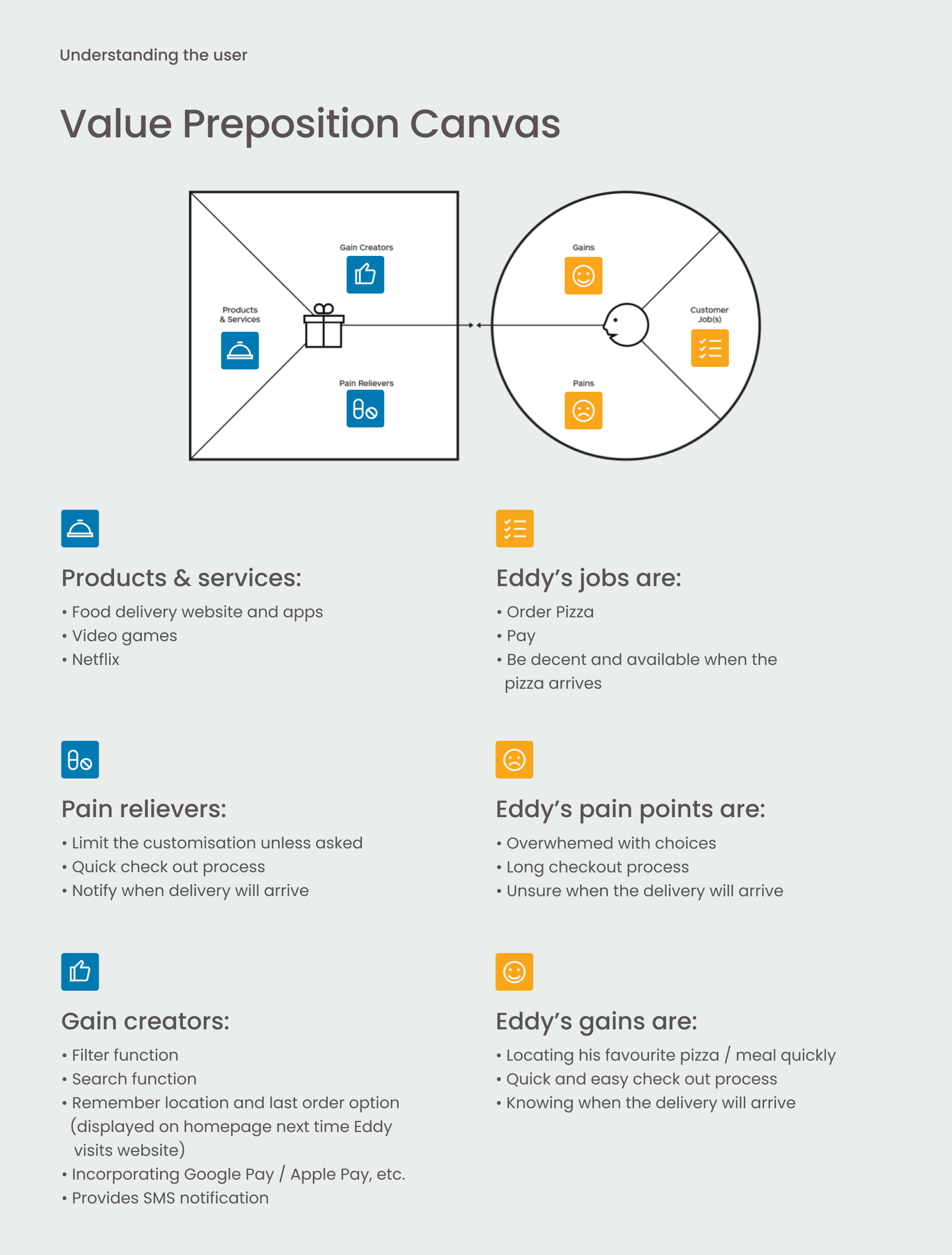
In order to narrow down the task and stay focused, I've written down some tradeoffs and assumptions.
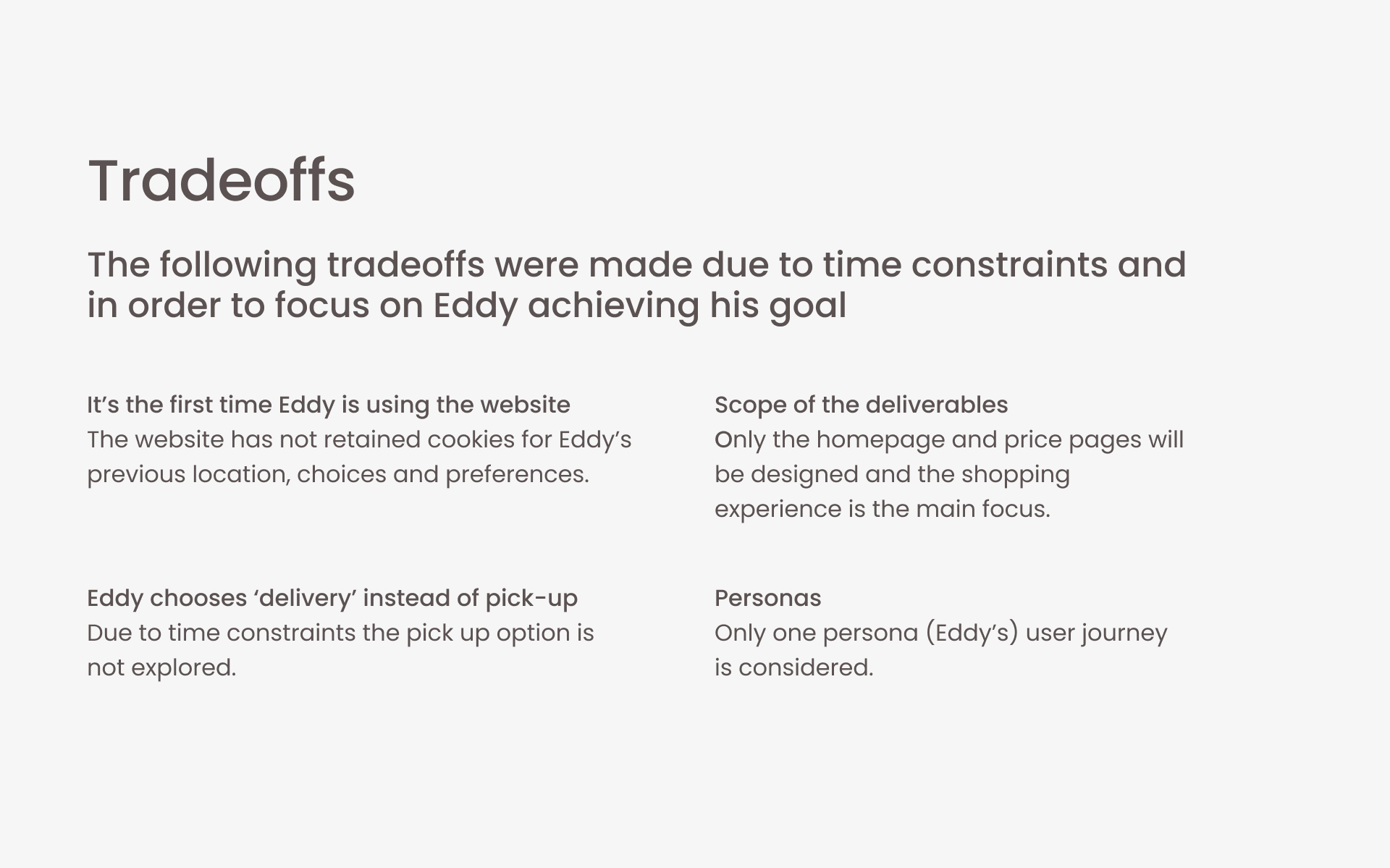
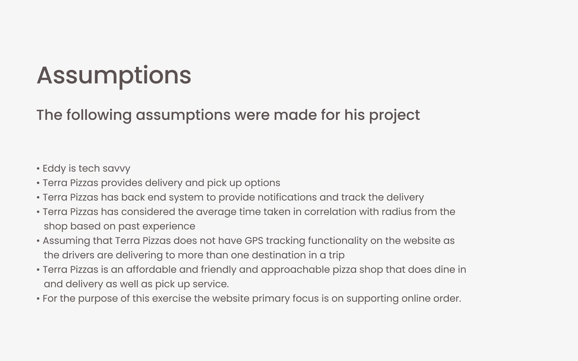
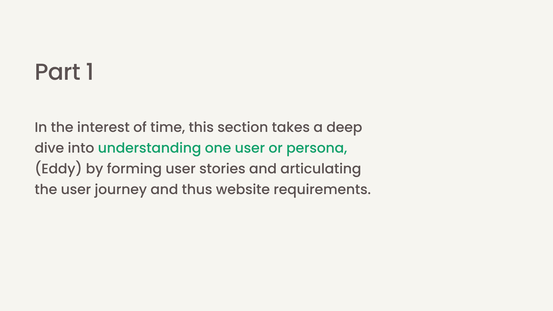
Due to the time limit, I decided to just study one persona.
I'm aware that there are other personas yet to be explored, who I presume, would order for parties and family meals.
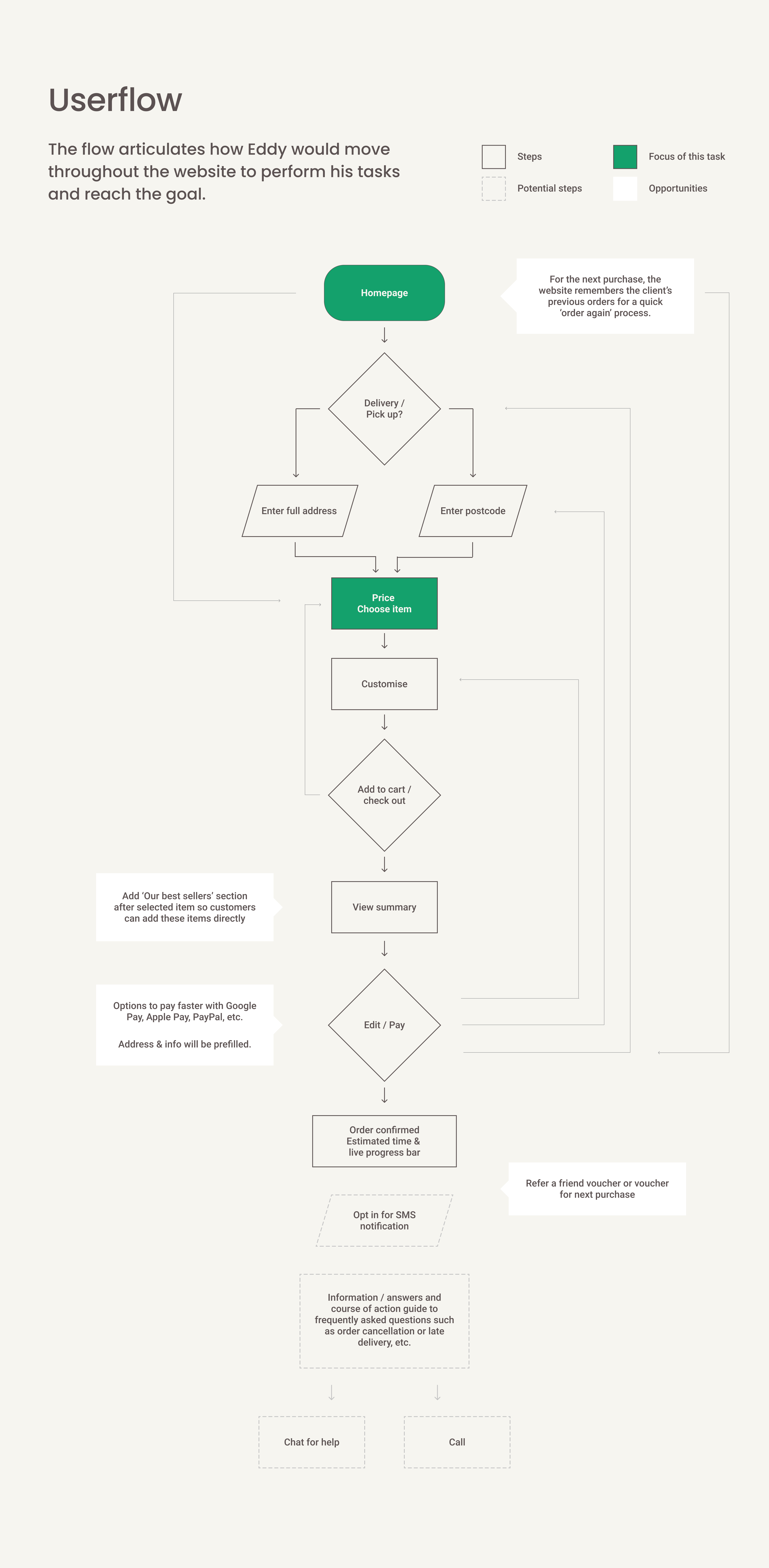
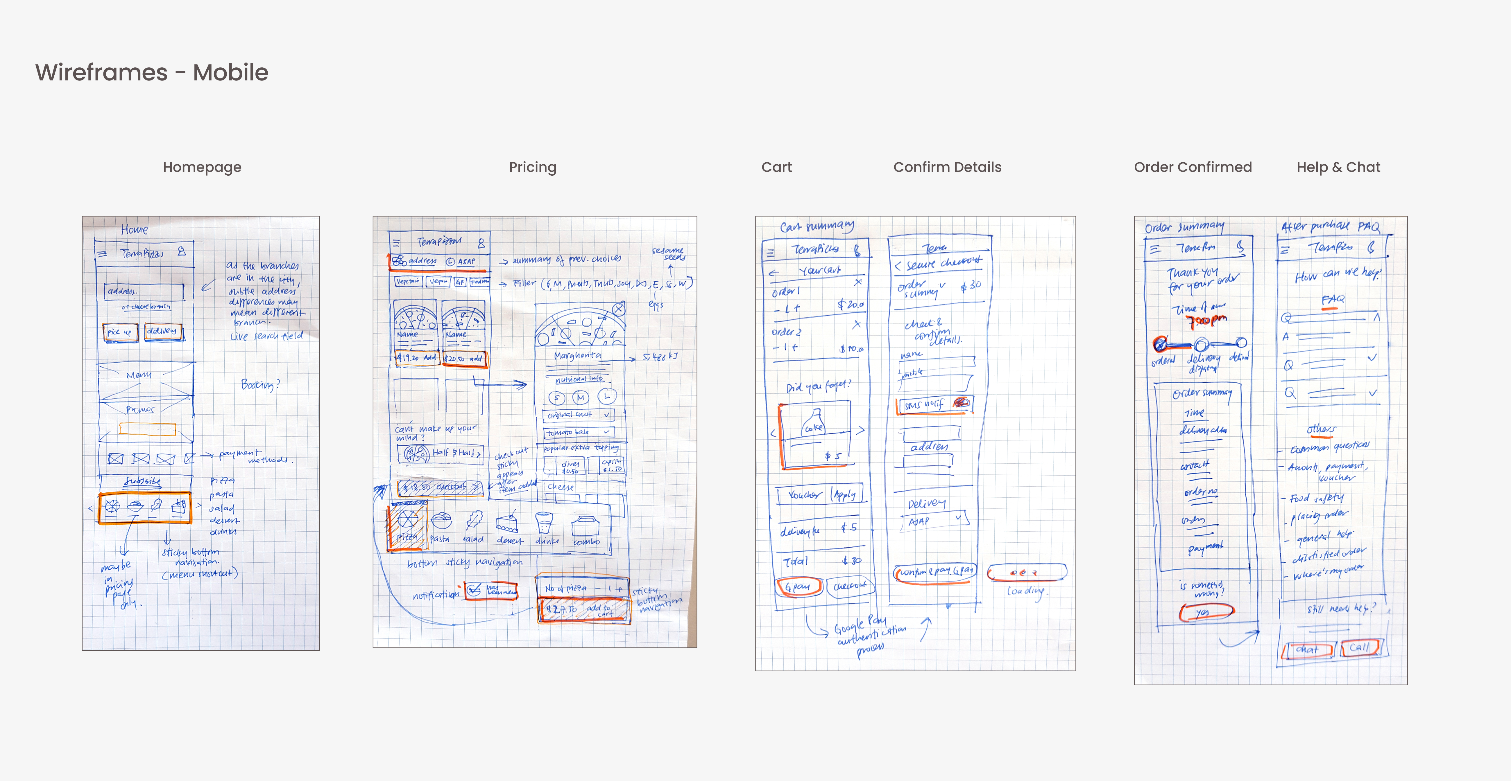
Wireframes
UI Design
UI Design
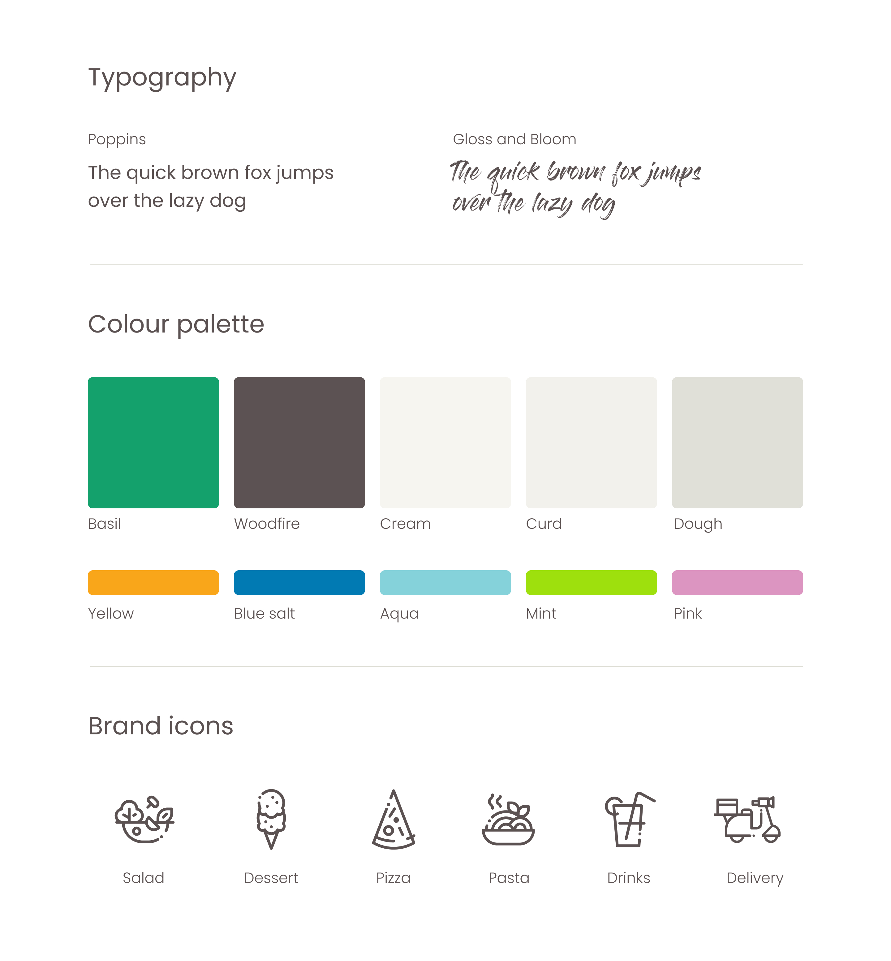
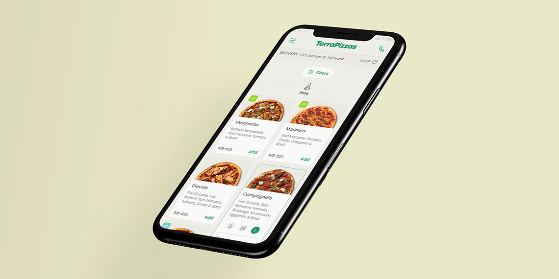
I had to create a simple style cheat sheet to keep all the visuals in line with the friendly and approchable Terra Pizzas brand I had in mind.
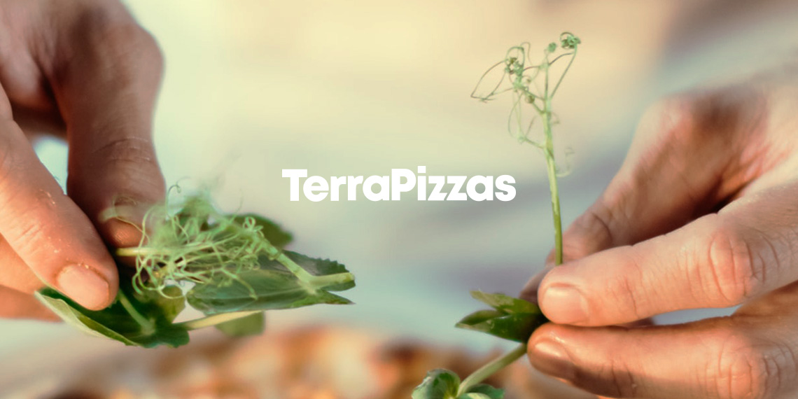
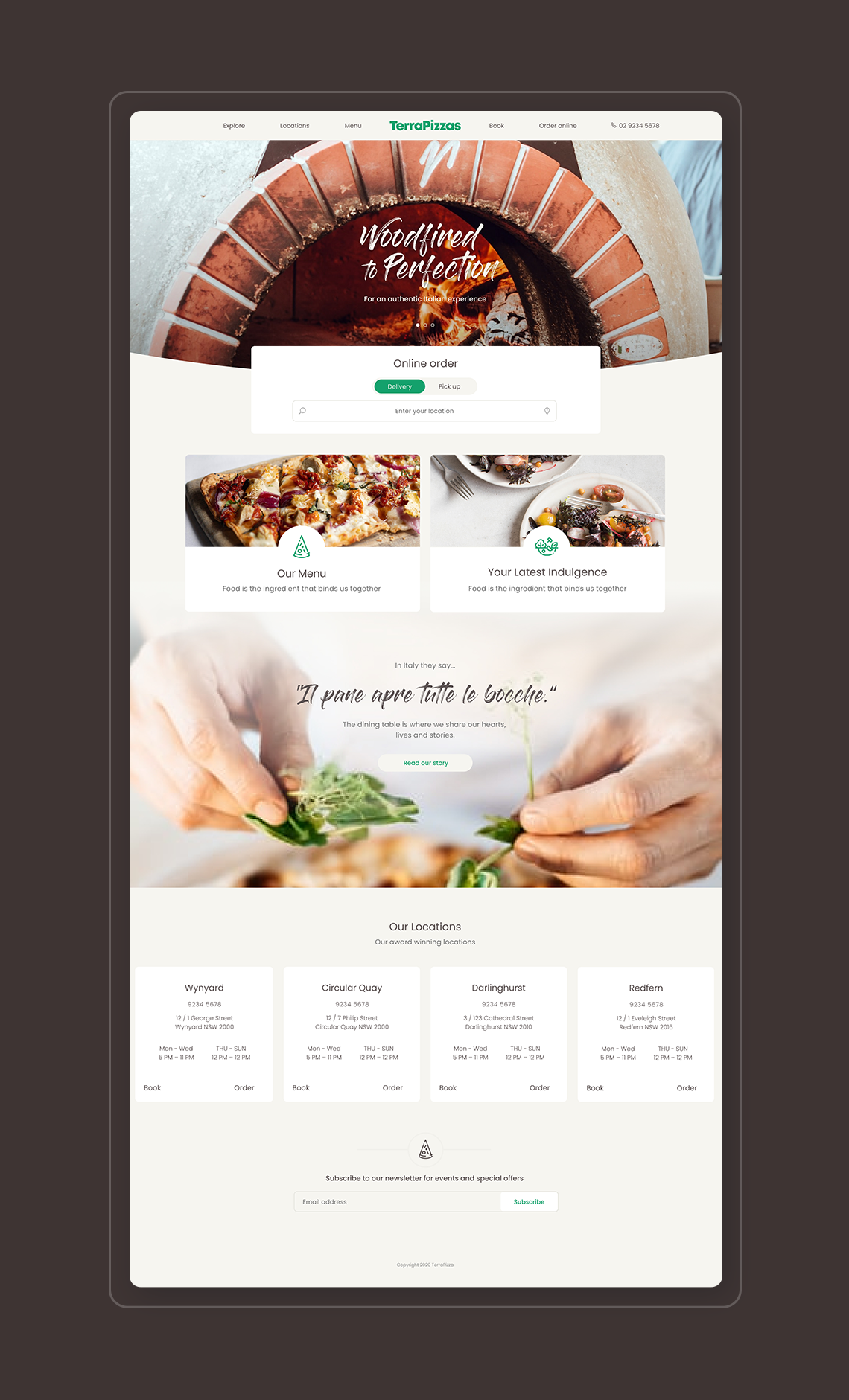
First, I establish the logotype, photography style (courtesy of Unsplash and Crust Pizza), typography, bespoke icons (to give a little fun and approchable personality to the brand) based on the circular shape in the letter 'a' of the logo and on the selection of colours.
As the company I was interviewing for had the colour green as the primary colour, I was hoping to show that I was comfortable working with one primary colour. To give a warmer feel to the restaurant brand, I've paired the green with deep brown and light cream.
In keeping with the approachable look and feel of the brand and inspired by the shape of the pizza itself, I decided to apply varying degrees of rounded corners on the design elements. And a curve on the base of the homepage feature image.
For the fonts, I've paired a friendly and approachable geometric Google font and an expressive handwritten font to give a sense of freshness and hand-made feel, inspired by the kneading dough and sprinking of flour in the pizza making process.
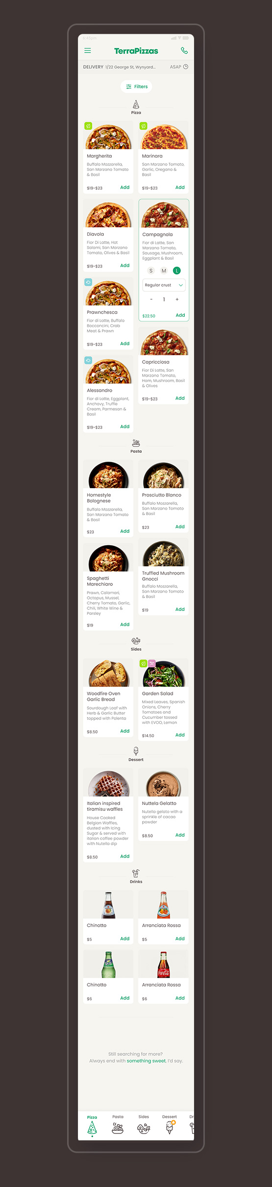
I also thought of different ways of visually upselling the desserts/drinks.
One way is to put a yellow star indicator next to the dessert section to entice customers to click on that section. I also added a note that would anchor link to the dessert section when the customer has scrolled down to the end of the menu.
Last but not least, I've added a carousel section for upselling just before the customer checks out.
Logo & Style Cheat Sheet
Clean file, clear mind.
Mobile design
Here's the video of the mobile prototype again!
Click here if you wish to click through the prototype in your own time.
Next steps
In the interview, I was asked what I would do If I had months instead of days to work on this project.
My answer was; talking to the stakeholders and have a better understanding of the brand and business KPIs. Understand business and customer pain points so we can prove or disprove initial hypothesis and get a proper problem statement to strive to solve. So that I can measure my success in a more tangible way. For example success might be measured by 20% increase in online sales.
Exploring other ways (interactions) of personalising the pizza such as pop-up instead of expandable card, etc.
Possibly developing the logo and visual identity a little further.
Usability testings and deriving information from analytics about where in the user journey is best to place a voucher for next purchase or discount for refering a friend and if it works at all to entice customers to come back.
Finding out through analytics which and whether the efforts we placed in 'upselling' the dessert and drinks are successful or do we have to explore different avenues.
Create a section for quick re-order on the homepage when the customer comes back to the website. Success might be measured by the engagement of returning online customers.
More qual, quant and usability testings of course and while I'm at it, actually try some of the pizzas!
Thank you for making it till the end. :)
In case you are wondering, I managed not to order a pizza throughout the whole process. Crazy, I know!
And as a result of this task, I got the offer as a Product / Visual Designer at Intuit - Quickbooks!
Selected Works
Benchmark GymUX Research + Usability Testing + Prototype
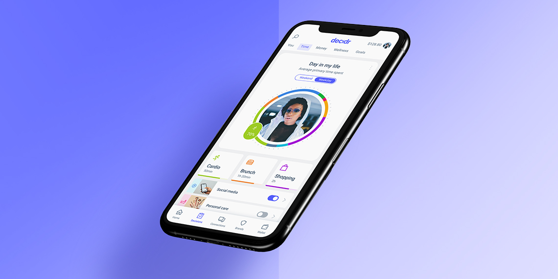
Hay (aspiring neobank) - work in progressMobile App, Product Design, UI & UX
Responsive Saas platform – light & dark Theme – work in progressDesign System, Dark & Light Mode, Logo
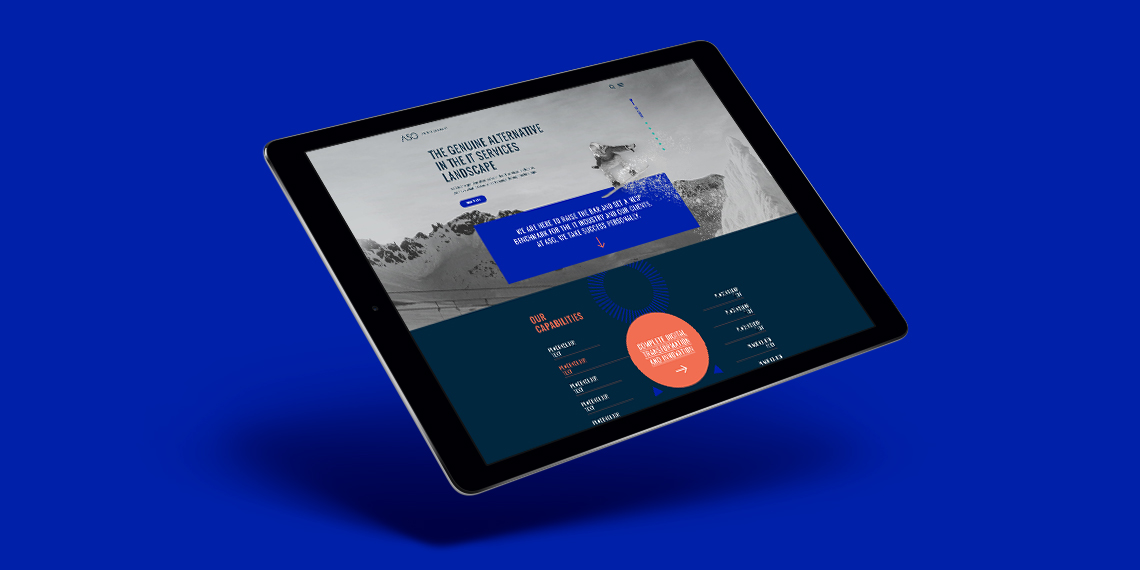
ASGLogo + Website
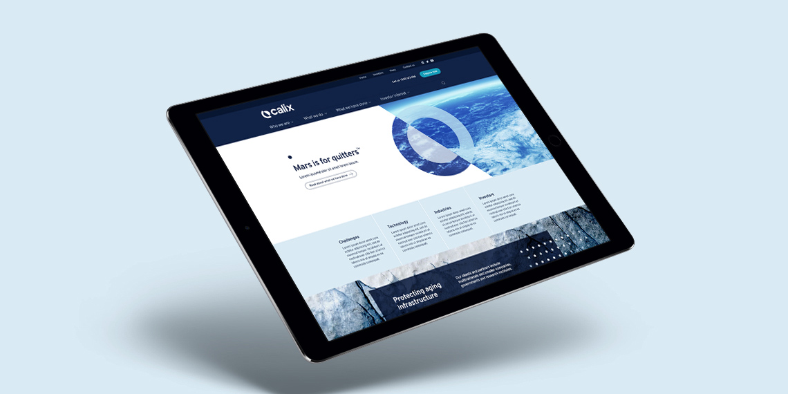
CalixLogo + Visual Identity + Website
PayrightLogo + Visual Identity + Campaign
HakoahVisual Identity
DeputyVisual Identity + Illustration
ImaginenationVisual Identity + Website
LogosLogotype & Logomark
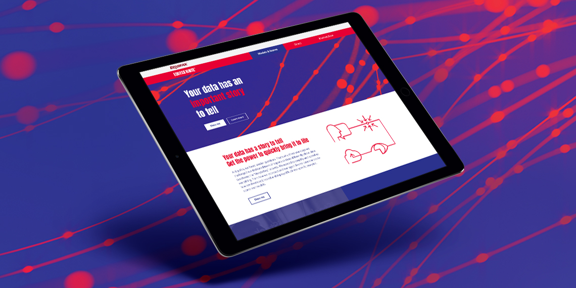
EquifaxWebsite, eDM, Visual Identity, Print
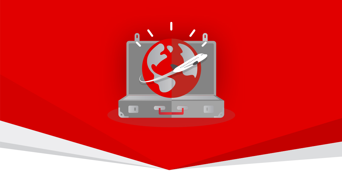
Vero – Qantas Business RewardsMini campaign

Vero - UI KitUI Kit
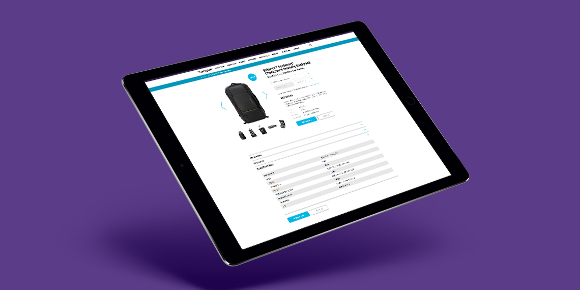
TargusWebsite improvement
CatholicCare WollongongVisual Identity
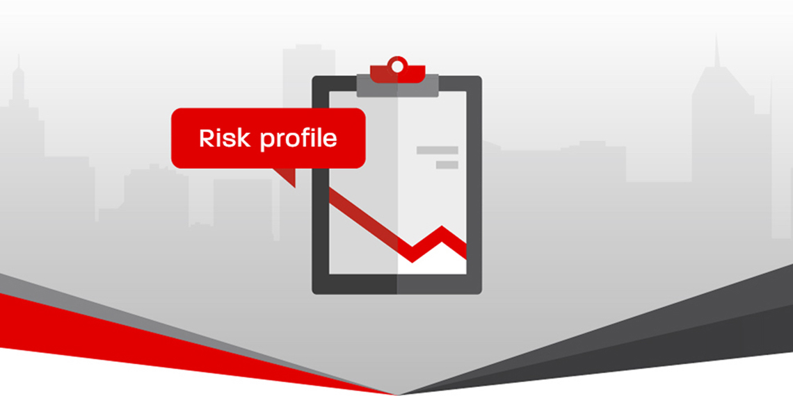
Vero – Risk Profiler ToolIconography, Digital Online Tool
All content © of the design agency and respective brands 2017-2020.