Client
Payright
Project
Logo, Visual Identity, Campaign
Completed
2019
Client
Payright
Project
Logo, Visual Identity, Campaign
Completed
2019
Overview
Payright is a pay-later financial service that facilitates flexible payments.
Overview
Payright is a pay-later financial service that faciitates flexible payments.
Overview
Payright is a pay-later financial service that faciitates flexible payments.

Challenge
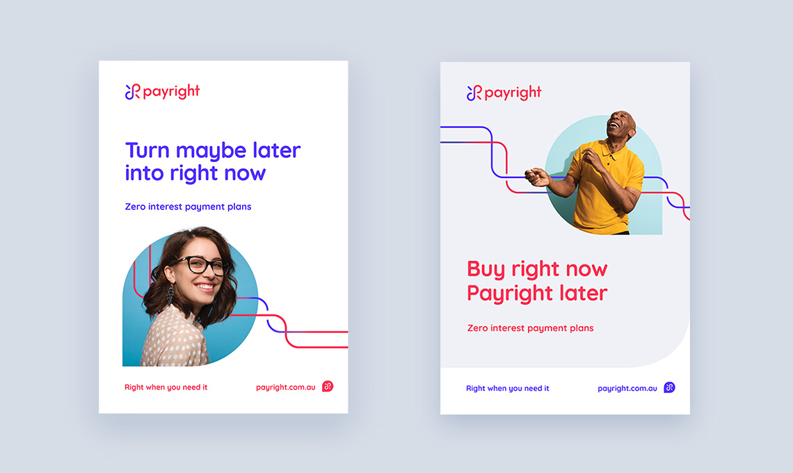
The task was to create a visual identity that elevates and differentiates Payright from an already saturated market of pay-later services. By highlighting the flexibility aspect using a line device in contrasting colours as well as curating the right subjects in the imagery that represents the target audience in a fresh studio-shot settings being elated, a dynamic and fresh visual identity is created.
Execution
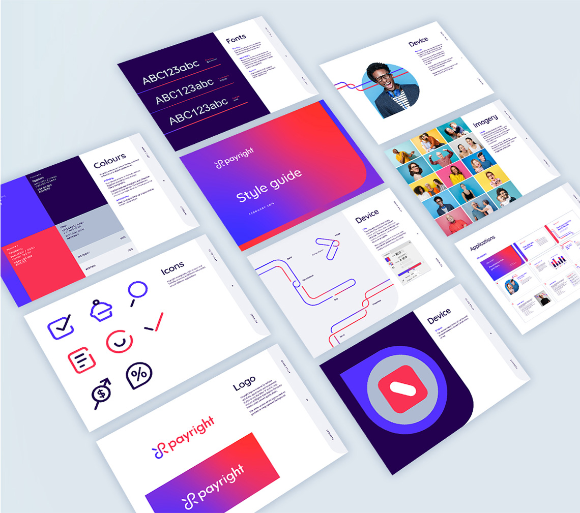
The typography, icons and shapes device were created with the same friendly, open look and feel. While the gradient creates a sense of movement and speed that relates to the ease of use of Payright.
The logo is an ambigram that depicts the letter ‘P’ and ‘R’, it can also be seen as an infinity symbol whereby Payright enables both consumers and merchants to have infinite possibilities.
Execution
The typography, icons and shapes device were created with the same friendly, open look and feel. While the gradient creates a sense of movement and speed that relates to the ease of use of Payright.
The logo is an ambigram that depicts the letter ‘P’ and ‘R’, it can also be seen as an infinity symbol whereby Payrght enables both consumers and merchant to have infinite possibilities.
Social Media Campaigns
After the brand is established, working alongside the copywriter, Henry Chase Richards, we came up with campaigns that are targeted towards the merchants.
Social Media Campaigns
After the brand is established, working alongside the copywriter, Henry Chase Richards, we came up with campaigns that are targeted towards the merchants.
Social Media Campaigns
After the brand is established, working alongside the copywriter, Henry Chase Richards, we came up with campaigns that are targeted towards the merchants.
Social Media Campaigns
After the brand is established, working alongside the copywriter, Henry Chase Richards, we came up with campaigns that are targeted towards the merchants.
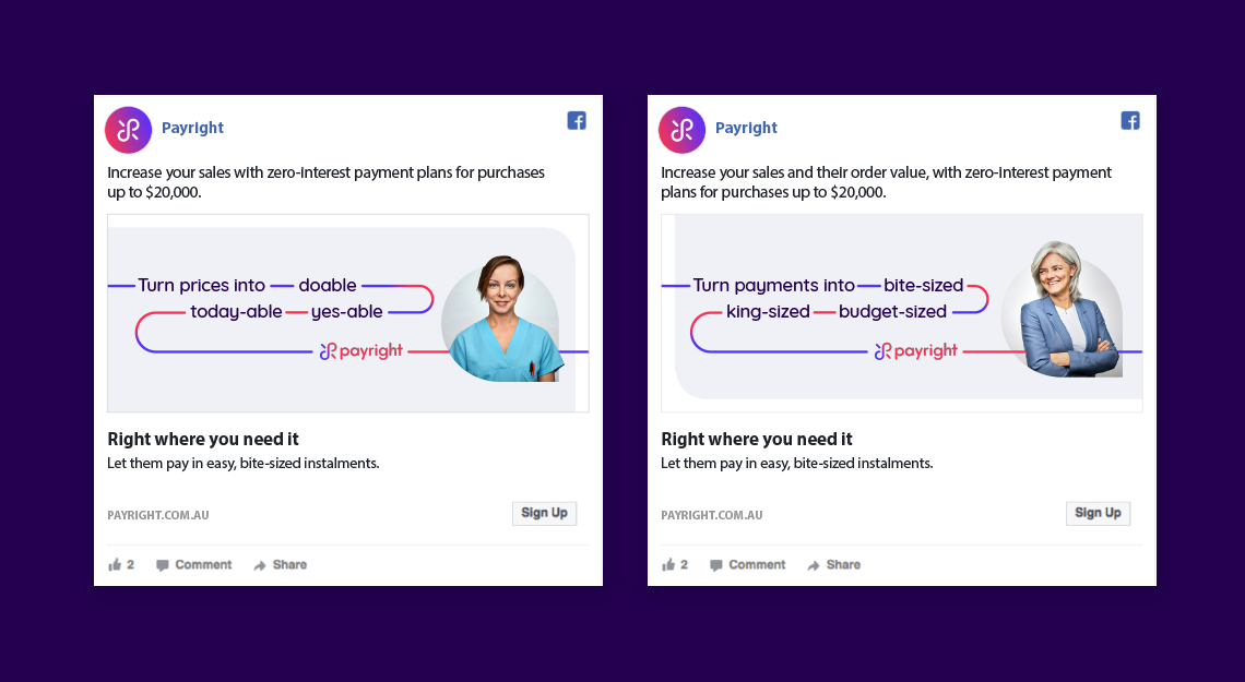
We integrated Payright unique selling point which was for purchases from $2,000 to $20,000. As the target merchants or partners are mostly photographers, aesthetician and the like, I incorporated them into the campaign.
We integrated Payright unique selling point which was for purchases from $2,000 to $20,000. As the target merchants or partners are mostly photographers, aesthetician and the like, I incorporated them into the campaign.
We integrated Payright unique selling point which was for purchases from $2,000 to $20,000. As the target merchants or partners are mostly photographers, aesthetician and the like, I incorporated them into the campaign.
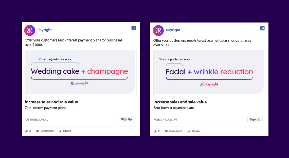
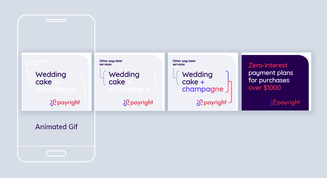
Another direction that we took was to try and tap into the current trends in memes. We looked at the reasons that consumers give for not making the purchase they wanted.
And show how using Payright can help change the consumer's mind and seal the purchase for the business.
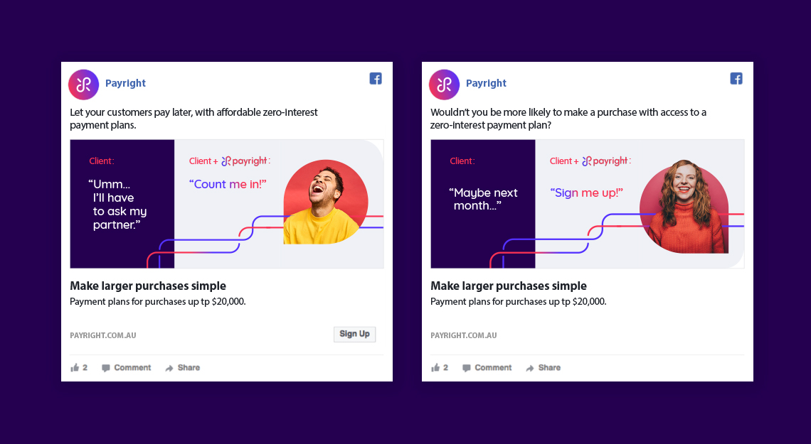
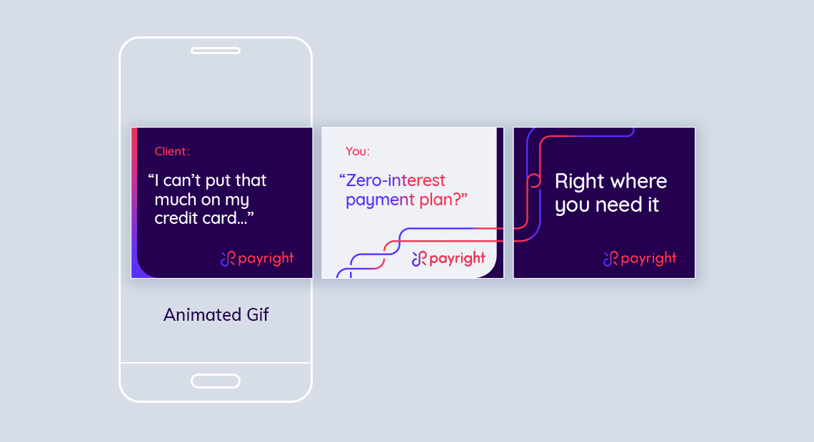
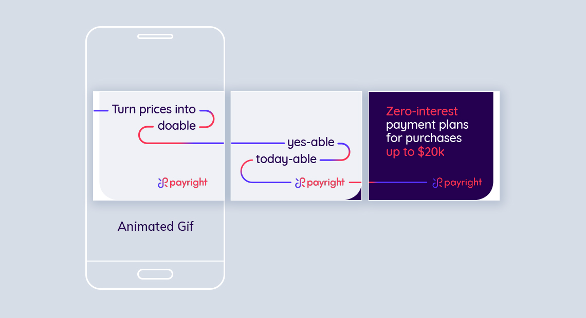
The last direction is to showcase how playful the copy and how flexible the line device can be and still be on brand.
This direction shows more personality and makes Payright stand out from the saturated market of pay-later services.
Selected Works
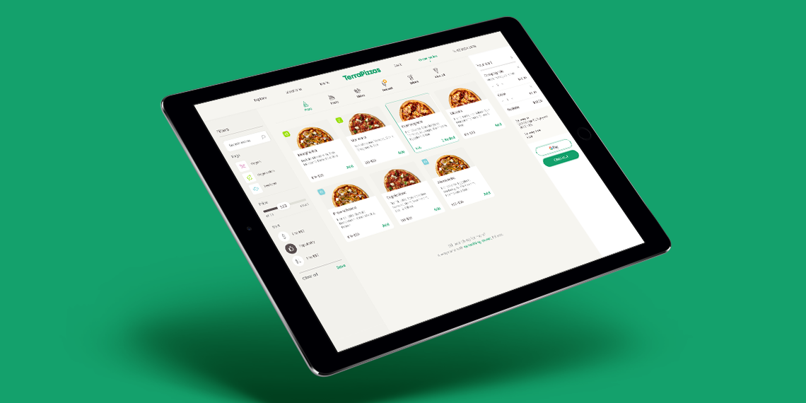
TerraPizzasTake Home Test, Ecommerce, UX & UI
Benchmark GymUX Research + Usability Testing + Prototype

Hay (aspiring neobank) - work in progressMobile App, Product Design, UI & UX

Responsive Saas platform – light & dark Theme – work in progressDesign System, Dark & Light Mode, Logo
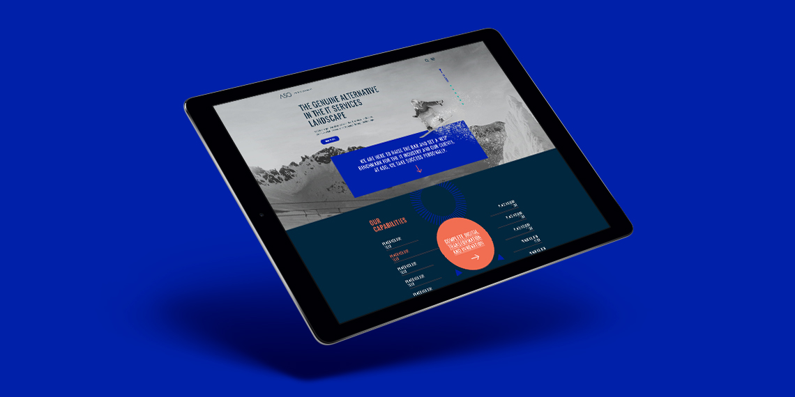
ASGLogo + Website
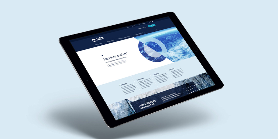
CalixLogo + Visual Identity + Website
HakoahVisual Identity

DeputyVisual Identity + Illustration
ImaginenationVisual Identity + Website
LogosLogotype & Logomark
EquifaxWebsite, eDM, Visual Identity, Print

Vero – Qantas Business RewardsMini campaign

Vero - UI KitUI Kit
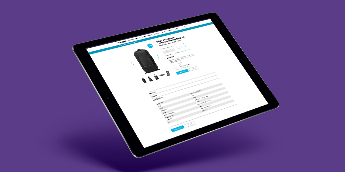
TargusWebsite improvement

CatholicCare WollongongVisual Identity

Vero – Risk Profiler ToolIconography, Digital Online Tool
All content © of the design agency and respective brands 2017-2020.
