Client
Various
Project
Logo, Logomark, Logotype
Completed
2017-2019
Overview
Below are some logos I've created for clients from very different industries while working at branding agencies.
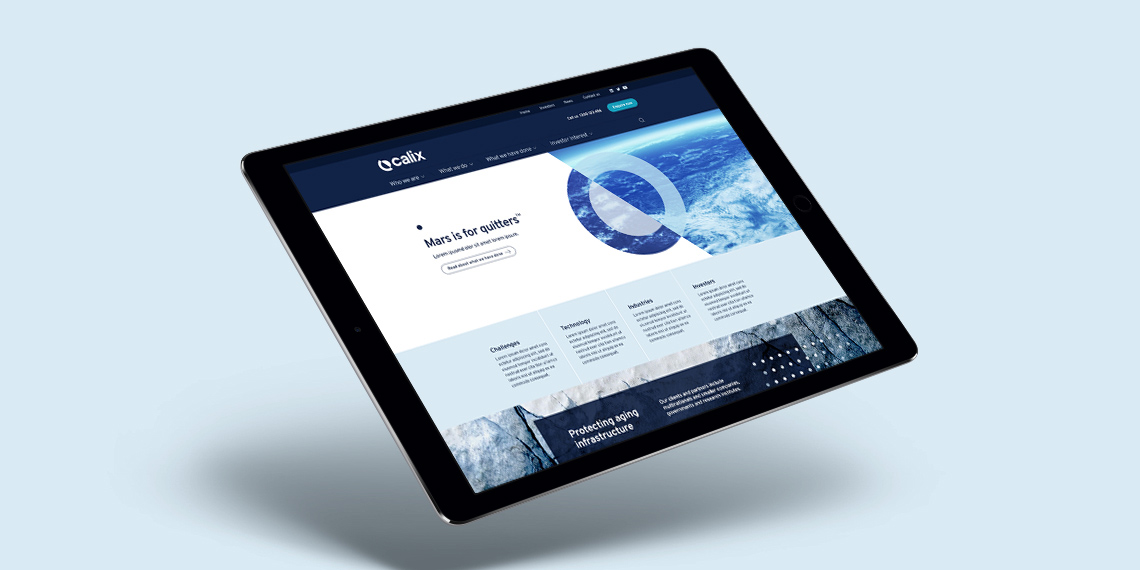
Calix
Science and Technology – Calix is a team of dedicated people developing a unique, patented technology to provide industrial solutions that address global sustainability challenges.
The Idea behind the logo mark is the earth, tilted on its axis. The depicts yin and yang and reversing the deterioration of the earth.
For more indepth look into the visual identity and website I desigend for Calix, please click here.
The Idea behind the logo mark is the earth, tilted on its axis. The depicts yin and yang and reversing the deterioration of the earth.
For more indepth look into the visual identity and website I desigend for Calix, please click here.
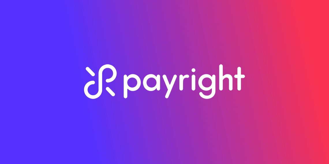
Payright
Payright is a pay-later financial service that facilitates flexible payments.
The logomark is an amigram of the letter 'P' and 'R' combined. So no matter how you spin it, it will look the same. The mark is also inspired by the infinity sign and the idea that Payright allows you to achive infinite possibilities! Please view Visual Identity I created here.
ASG
ASG Group is an innovative IT solutions and service provider in Australia, helping businesses achieve successful digital transformation.
As the brand personality is 'Game on', I decided to depict that into the ASG in an elevated way. Please check out the website design I did for this adrenaline-packed brand.
As the brand personality is 'Game on', I decided to depict that into the ASG in an elevated way. Please check out the website design I did for this adrenaline-packed brand.
Waymark
Waymark Hotels is a chain of hotels in rural Australia. They strive to build prosperity for everyone from locals to employees, to partners and investors.
The logomark is inspired by an Ibis bird taking flight from coast to coast and Australian native plant, the yellow Wattle. Crafting the two together in an elegant way, I created a logomark that feels humble, local and elevated Australian hotel brand.
Frank Robinson
Frank Robinson is a high-end bespoke jeweller located in Double Bay, NSW, Australia. With over 30 years of experience in the Jewellery industry, Frank Robinson has been interpreting clients design ideas and fulfilling their wishes for beautiful jewellery.
This is a bespoke hand lettering logo I created for a bespoke jeweller. The colours represents the gaudy character of the jeweller and reflects the daring designs that he curates.
Vinta
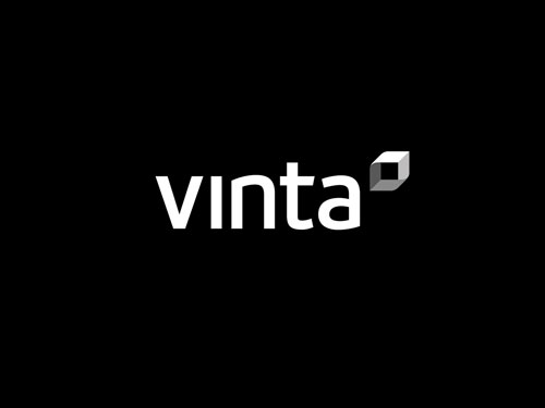
Vinta is a private integrated property group with commercial property investments in prize locations across Australia and New Zealand.
Inspired by building blocks, the idea of space and the possibilities within it, I created a logomark with paradox illusion like the Penrose Triangle.

Discovery Mortgage Fund
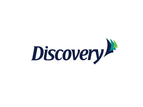
Taking inspiration from the name and the type of client, I crafted the logotype to subtly resemble the hull of a sailing ship. The three triangles represent a ship has set sail and is moving forward to discover new frontiers.
Selected Works
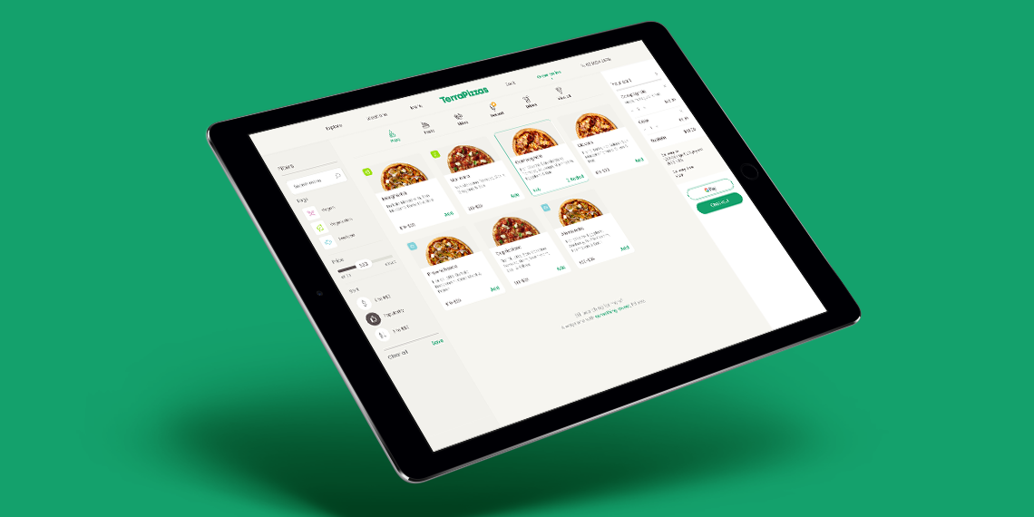
TerraPizzasTake Home Test, Ecommerce, UX & UI
Benchmark GymUX Research + Usability Testing + Prototype

Hay (aspiring neobank) - work in progressMobile App, Product Design, UI & UX
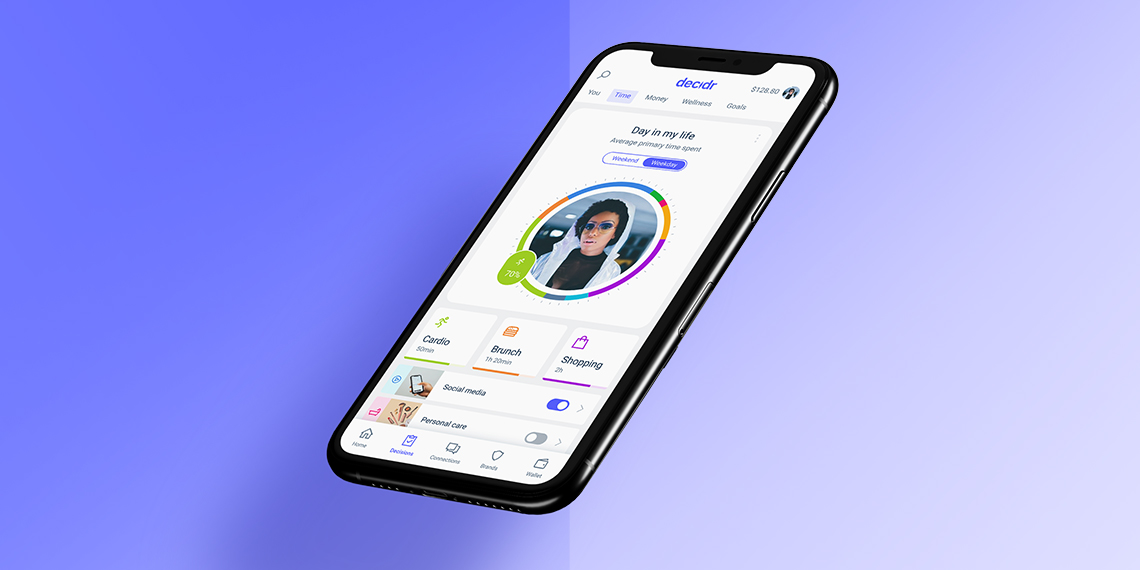
Responsive Saas platform – light & dark Theme – work in progressDesign System, Dark & Light Mode, Logo
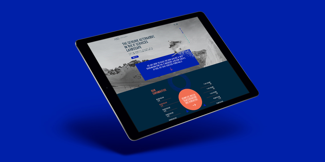
ASGLogo + Website
CalixLogo + Visual Identity + Website
PayrightLogo + Visual Identity + Campaign
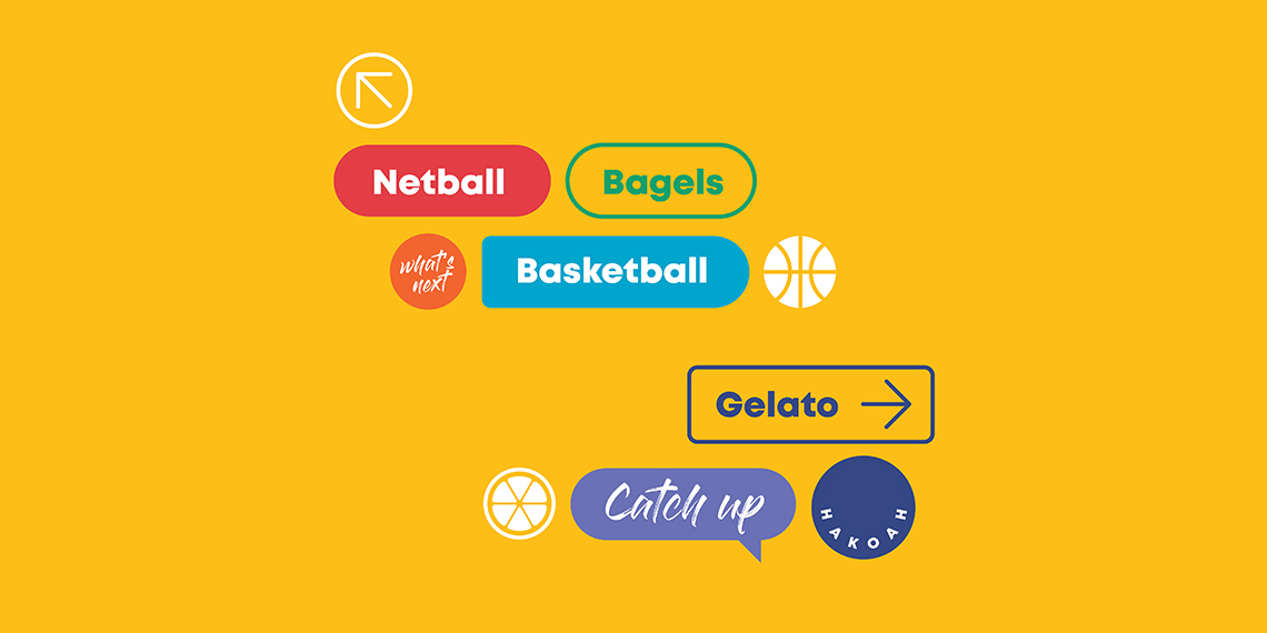
HakoahVisual Identity

DeputyVisual Identity + Illustration
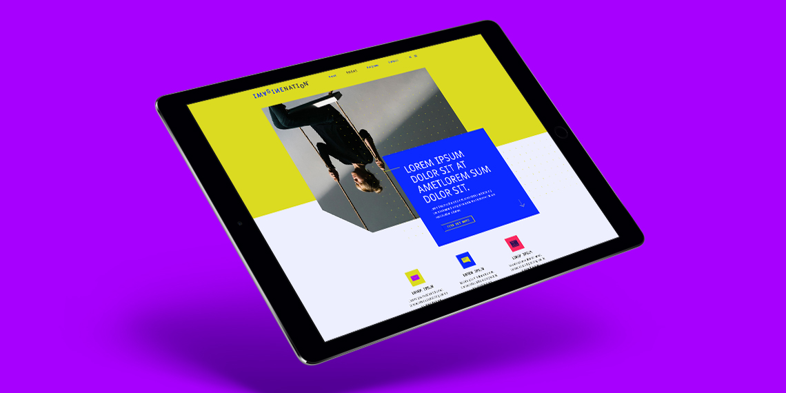
ImaginenationVisual Identity + Website
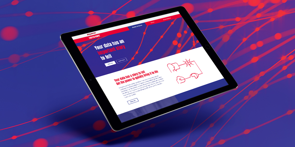
EquifaxWebsite, eDM, Visual Identity, Print

Vero – Qantas Business RewardsMini campaign

Vero - UI KitUI Kit
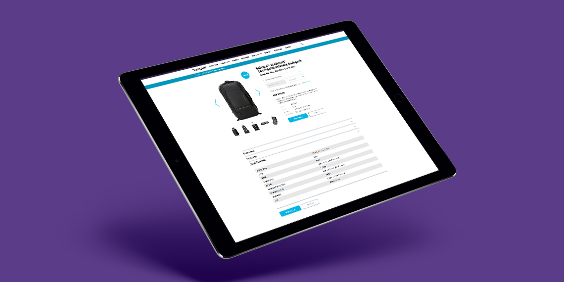
TargusWebsite improvement

CatholicCare WollongongVisual Identity

Vero – Risk Profiler ToolIconography, Digital Online Tool
